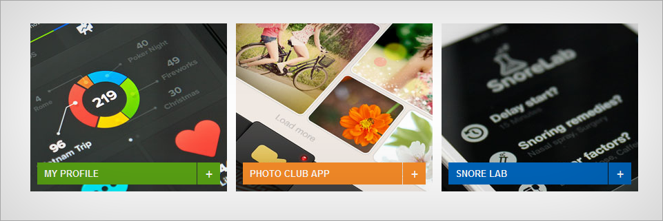
Pure CSS3 image hover transition
This is an image gallery Showcase with CSS3 Transitions/Animations on Hover. This will work on all major Browsers and we have also done a fallback for older browsers like IE. This can be very useful to corporate, business or even personal projects. Fully customizable and self-descriptive code.
The HTML
<div id="container">
<ul class="showcase">
<li class="thumb1"> <a href="http://blog.web3canvas.com/"><img src="images/thumb1.jpg" width="500" height="374" alt="web3canvas">
<h3>My Profile<i>+</i></h3>
<p>Lorem ipsum dolor sit amet, consectetur adipiscing elit. Etiam a sem leo. Pellentesque et libero id lectus pretium lacinia...</p>
</a> </li>
<li class="thumb2"> <a href="https://web3canvas.com/" target="_blank"><img src="images/thumb2.jpg" width="500" height="374" alt="web3canvas">
<h3>Photo Club App<i>+</i></h3>
<p>Nulla ultrices rutrum justo, nec condimentum metus sodales at. Phasellus at lectus tortor, nec varius ligula. Suspendisse tincidunt...</p>
</a> </li>
<li class="thumb3"> <a href="http://blog.web3canvas.com/"><img src="images/thumb3.jpg" width="500" height="374" alt="web3canvas">
<h3>Snore Lab<i>+</i></h3>
<p>Donec elementum nisi eget urna egestas auctor. Praesent feugiat egestas justo eu vehicula. Pellentesque sed nisl dui. Ut non odio metus...</p>
</a> </li>
</ul>
</div>
The CSS
#container {
margin:50px auto;
width:1000px;
}

.showcase {
list-style: none;
padding: 0 0 40px 40px;
height: 244px;
}
.showcase li {
float: left;
width: 285px;
height: 244px;
overflow: hidden;
margin: 0 13px 0 0;
}
.showcase a {
display: block;
width: 285px;
height: 244px;
overflow: hidden;
position: relative;
text-decoration: none;
}
.showcase a img {
width: 500px;
height: 374px;
margin: 0 auto;
position: absolute;
left: -104px;
top: -40px;
-webkit-transition: all 0.2s ease-out;
-moz-transition: all 0.2s ease-out;
-o-transition: all 0.2s ease-out;
transition: all 0.2s ease-out;
}
.showcase a:hover img {
width: 285px;
height: 213px;
left: 0;
top: -10px;
}
.showcase a p {
background: #59A214;
color: #fff;
font-size: 11px;
padding: 12px 20px;
position:absolute;
bottom:-100px;
line-height: 20px;
display: block;
width: 245px;
cursor: pointer;
-webkit-transition: all 0.2s ease-out;
-moz-transition: all 0.2s ease-out;
-o-transition: all 0.2s ease-out;
transition: all 0.2s ease-out;
}
.showcase a:hover p {
bottom: 0;
background: #3C840B;
}
.showcase a h3 {
font-size: 13px;
text-transform: uppercase;
color: #fff;
background: #59A214;
width: 211px;
padding: 8px 10px;
position: absolute;
left:10px;
bottom:10px;
cursor: pointer;
-webkit-transition: all 0.2s ease-out;
-moz-transition: all 0.2s ease-out;
-o-transition: all 0.2s ease-out;
transition: all 0.2s ease-out;
}
.showcase a:hover h3 {
bottom:94px;
background: #3C840B;
}
.showcase a h3 i {
width: 33px;
height: 26px;
position: absolute;
right: -34px;
top: 0;
background: #59A214;
-webkit-transition: all 0.2s ease-out;
-moz-transition: all 0.2s ease-out;
-o-transition: all 0.2s ease-out;
transition: all 0.2s ease-out;
font-size:18px;
font-weight:normal;
text-align:center;
padding:6px 0 0 0;
}
.showcase .thumb2 a p, .showcase .thumb2 a h3 {
background: #F68B28;
}
.showcase .thumb2 a:hover p, .showcase .thumb2 a:hover h3 {
background: #F16B17;
}
.showcase .thumb2 a h3 i {
background: #F68B28;
}
.showcase .thumb2 a:hover h3 i {
background: #F16B17;
}
.showcase .thumb3 a p, .showcase .thumb3 a h3 {
background: #0065BB;
}
.showcase .thumb3 a:hover p, .showcase .thumb3 a:hover h3 {
background: #0046A2;
}
.showcase .thumb3 a h3 i {
background: #0065BB;
}
.showcase .thumb3 a:hover h3 i {
background: #0046A2;
}
Please copy your images in to “images folder” and you are done. You can also check the live demo and of course you can download source code on left side.