I’m using Bootstrap 3 since its release and it’s really awesome as you already know. But recently I’ve found a great feature on Bootstrap 3 when I dig through their Documentation. It’s a little nifty addition in version 3 but I never noticed because of its less emphasis on the docs.
Re-ordering columns might be the most wished feature in responsive design. So, Bootstrap has added an option to re-arrange columns in mobile devices by adding a simple class without using Flexbox. This is a great option because we don’t have to worry about browser compatibility, because it’s not using the modern Flexbox CSS (even its great).
Push Pull Feature:
Re arrange columns in mobile devices using bootstrap 3
Yes. Push Pull is the new bootstrap feature I’m talking about. So let’s see how we can implement this in a real website.
Problem
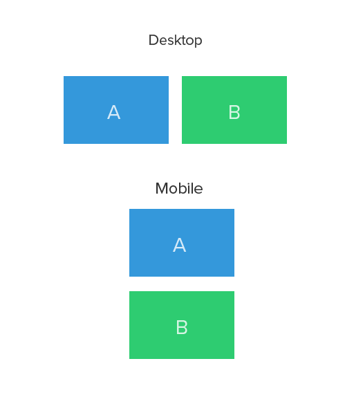
Here’s a normal responsive design would look like in desktop and mobile
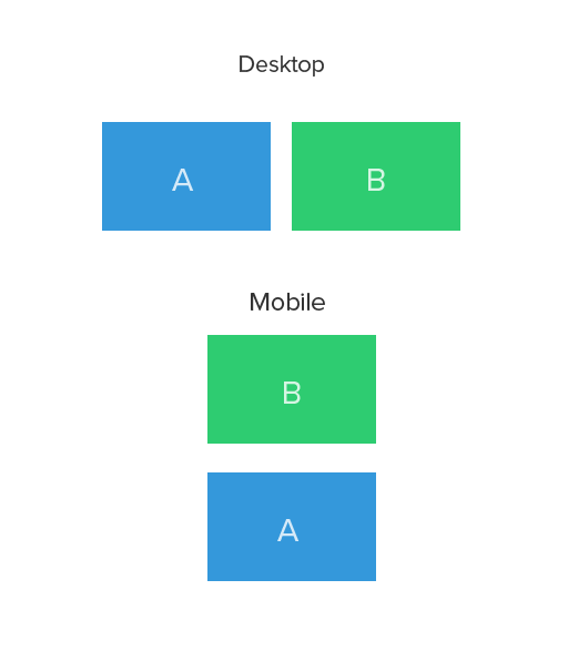
Here’s the layout we want to achieve (see order of div A & B in mobile)
Solution
Solution is really simple. Just add a .col-md-push-* and .col-md-pull-* modifier classes
Eg:
<div class="row">
   <div class="col-md-6 col-md-push-6">B </div>
   <div class="col-md-6 col-md-pull-6">A</div>
 </div>
Remember Bootstrap is Mobile first. So we are not changing the order from desktop to mobile. Instead we change the order from Mobile to Desktop. Write code for mobile and add push pull for desktops.
Also, If you are wondering how it works, Here is the CSS
.col-md-push-6 {
left: 50%;
}

.col-md-pull-6 {
right: 50%;
}
Conclusion
I have used this method in several sites recently and found no issues. But be sure to check yourself before using it. You can also use Flexbox CSS to re-order columns if you are planning to support modern browsers only.
Hope you find this article useful. Let me know your thoughts via comments.