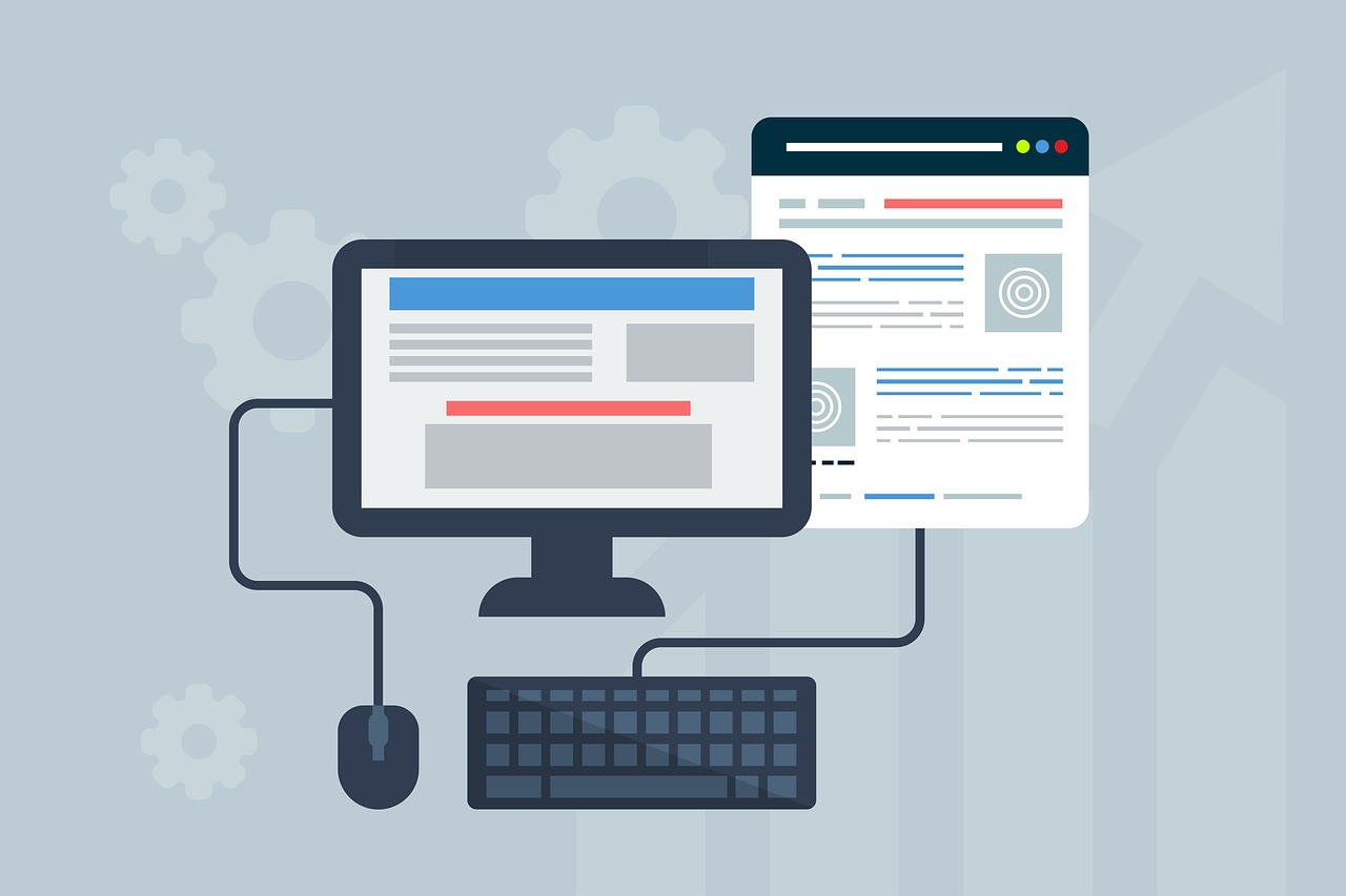
eCommerce is a blanket term that encompasses just about any transaction that occurs on the internet. Any website armed with eCommerce functionality and enables customers to buy a product or service is an eCommerce website. With the world going digital today, eCommerce web development has become an in-demand and profitable venture.
From startups, small enterprises and big brands, there are a great number of organizations that could benefit from having their own eCommerce website where they could sell products and services. In the highly competitive-focused and convenience-focused society today, consumers no longer want to venture to the streets to purchase. Rather, they want to shop from the convenience of their homes, which make eCommerce a flexible solution for business organizations and customers alike.
Any company or business would want buyers to be impressed by the website. It’s one thing to have an attractive online presence, but this however doesn’t mean the site would function or convert the way that you want it to.
In the same way, you could have a site that technically functions well with all the right content and features, but if the design and user experience is unappealing, it could stain the brand and could ultimately result in less traffic and less conversions. Thus, having a web design and User Experience patterns that boost conversion rates is paramount.
Web Design and UX Trends to Boost rates of Conversion

1. Full-page headers
Are the way to go for 2020 modern web design. In ecommerce web design, designers could implement variations in the header. A popular set however involves adding key text or CTA or call-to-action buttons to the left of the header with images that are eye-catching on the right side. This is because readers have the tendency to focus most attention on the top left of the page.
2. White space
Web design trend today goes back to minimalism with an array of purposeful white space, pretty much similar to print magazines.White space, similar to natural currents help visitors via the pages, flowing from element to element that creates a visual hierarchy.
The white space breathing room allows the eyes of viewers to rest. Moreover, it helps in understanding by defining the relationships between page elements. A couple of elements hurdled together without much white space between would be deemed by the eyes as one unit. However, it they are further apart, the eyes will see them as separate.
White space enables visitors to identify the hierarchy of a website. White space is also used to find the most critical information on pages, that’s why knowing how to use white space could greatly boost the UX.
3. Dynamic scrolling
It’s another modern web and UX design trend this year. One version sets various scrolling speeds for the foreground of a website and background to provide a 3D effect to web visitors. You could trigger animations and make images look like magic with dynamic scrolling.
4. Playful cursors
Modern trend features cursors that make a new experience when it comes to viewing pages. Playful cursors on a website could be as simple as changing the shape of the cursor or as complicated as coding animations that are cursor-triggered. Whichever way, visitors will surely have a wonderful time engaging with cursors that are one-of-a-kind. Adding spice to a website is possible by adding a unique cursor element.
5. Grid designs
Designer at present would continue playing with grid designs. Moreover, an asymmetric layout would likely be even more popular. Most designers today use CSS Grid layout for bringing to the web all the print layout capabilities. Grid enables web designers to make for easy and consistent layouts for complex responsive website design across browsers.
6. Trends in color
Exploring color palettes is the trend today. Moreover, each year there is a new color for the web. Back in 2018 it was yellow, blue in 2019 and this year, it is predicted to be mint. Since gradients cover a wide array of colors, they are perfect in targeting a wider audience.
The psychology of color also plays an important role in website design trends today. Designers should consider the psychology behind colors before getting a new website palette. Keep in mind, colors should match the brand. Some smaller color trend would likely continue at present, such as:
- Cool, soft colors like greys, blues and teals for Information and backgrounds.
- Warm, bold colors such as oranges, reds and even greens for CTAs or calls to action.
7. Custom illustrations
Illustrations breathe life into the brand and the website. Contemporary designs get inspiration from print publishing and other traditional art forms as well. Gone are the cookie-cutter days where in sites integrate custom illustrations to a contemporary website design. With improved capabilities for coding, illustrations will continue to evolve beyond the 2D design.
8. More focus on UX/UX
Modern web design in 2018 focuses on humans and would even be more important this year. The UX design of the site should be uninterrupted, smooth and engaging, meaning:
- little clutter
- past load page
- relevant, scannable SEO content
Website designers wrap creativity and functionality to build a great UX, leaning towards clean design while remaining unique and creative.
The UX and UI on a website should be intuitive, which means:
- Image captions
- Interfaces that are voice-enabled
- Absence of distracting elements
- Video transcriptions
- Balanced motion design
Level up the UX/UI through:
- Providing easy-to-read content as well as easy-to-use interfaces to visitors.
- Hit the artistic sweet tooth.
9. Bold fonts
The web design trend today would even play more with fonts. Serif and san-serif fonts continue to be popular as ever. Surprisingly, the vintage type is making a comeback. Outlined and bold type are making their appearance in a lot of places nowadays, from names of the brand to the landing page headings in which the most prominent trend is a screen-dominating text.
Choose a typeface that matches the brand, the goal and of course the audience. Go for an easy-to-read text typeface for any content on a site. The text’s readability is one of the critical factors in boosting the website’s UX. An unassuming, simple sans-serif like Arial is a wonderful choice.
10. Engaging, impactful stories
This year, modern websites would shine at telling stories. To truly evolve into a modern site, a website should be able to learn how to tell enthralling stories in its content as well as ad campaigns. A compelling and classy web design story will surely engage and convert the target audience.
Author Bio
Shira Gray is working as a Business Development Executive at eCommerce web Development Company – eTatvaSoft. She writes about emerging technologies and you can visit our blog to know more about her writings. Being a tech geek, she keeps a close watch over the industry focusing on the latest technology news and gadgets.
Banner Illustration by Glenn Thomas


