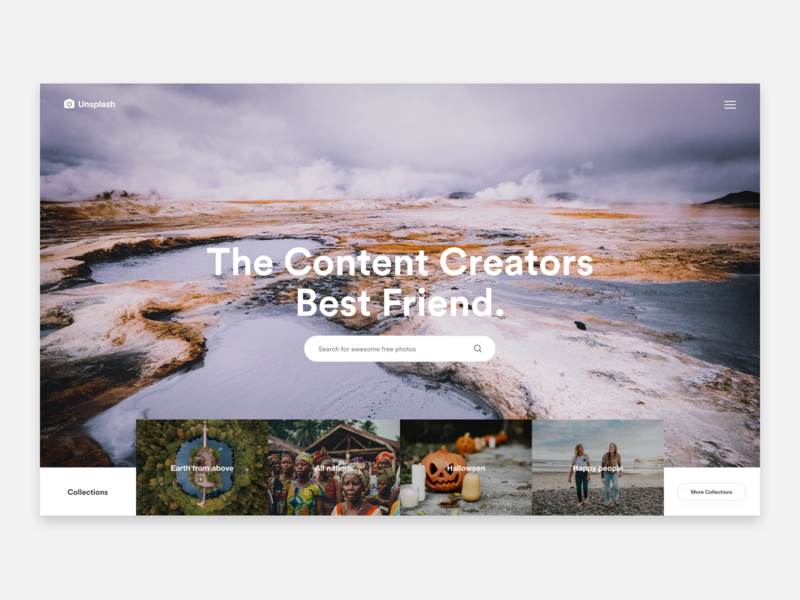
Creating websites for new businesses can be challenging enough, but when the business owner doesn’t have photos to provide you, it can be even more difficult. And when working with an existing business, you may find that their photos are poor quality, unappealing, or ineffective. While you may be subscribed to a pay-per-stock-photo or subscription website, you may also want to consider how you can also better use all the free stock photos out there to make your client’s web pages more dynamic and engaging.
One of the biggest benefits of free stock photos is that they’re free. It seems silly if you have a client with a gardening business that you would have to pay for photos for their blog posts when all you need are some great free high-quality photographs of nature. Most stock photo services come with a limit on how many photos you can use per month. Why choose to pay for one of these and cut into your profit margin if you don’t have to?
As your client base grows, make sure you can use the resources available to you to encourage them to return and recommend your services to their friends. So, we’ve come up with some ways to integrate free stock photos in your designs to increase reader retention, add to the visual appeal, and increase the effectiveness of your client’s marketing.
Choose Photos That are Visually Pleasing and Thought-Provoking
You’re well aware of the basics of user-friendly and attractive web design, but take it a step further and learn more about how the human brain processes images and the fundamental principles of design. This will help you to better select photos that are engaging and attractive to your clients’ audience. If your client finds the photos appealing, they will likely consider your overall design more inviting, too.
Some things to think about include contrast, balance (this does not mean you should choose symmetrical photos), movement, proportion, and unity. If these sound foreign to you, learn more about them. You won’t regret it.
Find the Right Images to Tell a Story
When selecting a stock photo, make sure it makes sense with your client’s brand and let the photo be a vehicle for their story (or the content’s story).
If you’re working with a client that specializes in grief and loss, don’t choose a stock photo of a young couple joyfully playing with a child. This wouldn’t make sense in terms of the brand or story. You also should not choose a picture of a funeral— that’s too on-the-nose. Find a photo of an older woman lookin g off into the distance. This gives the viewer more opportunity to read into the story of the photo and feel motivated to learn more.
Use Photos with People
People naturally like to see other people. We’re naturally drawn to images of other humans. Pictures of people make for great marketing because they appeal to us emotionally, and they give the reader an implied buyer that they can relate to or make a blog post more alluring to read.
When we see other people, we naturally feel the desire to connect emotionally. People often have a knack for remembering faces, too, which means that your client’s website and content will be more memorable. Seeing people also increases curiosity and interest in a story. Experiment how and why this works, but scrolling through a blog. Do you tend to click on the posts that have a picture of a person rather than just a setting? There’s a reason why.
Candid is Often Better Than Posed
When scrolling through free stock images, try to find pictures that look more candid and less posed. One way to decide this is to ask if you can tell it’s on a set or if it would look right on a magazine cover.
People tend to trust candid shots more because they invest in the spontaneity. If your client’s brand is fun and young, it’s often difficult to convey this through a posed photograph.
Remember that candid also means imperfect. Imperfection stirs relatability and engages a viewer more than a perfectly planned shot will. Candid photos build a story about what led to the moment and what’s to follow. And these photos are more difficult for a viewer to ignore when clicking on a landing page.
Re-Mix a Photo to Make it Better
Firstly, don’t use overly re-touched free stock photos. If your client sells waist trainers, and you’re searching for images of women with remarkable waistlines, don’t choose a picture that looks like the model has no organs. This will create doubt in the viewer, and they’ll begin to question the reliability of your client’s website and product.
You can crop images to make a more interesting composition or to single in on one person. You can also add text to create a picture that might work well for your client to share via social media.
You can also create a mash-up or collage using stock photos. These work well for blog posts and social media links. Make sure the photo license allows you to alert the original before you devote too much time or post it.
When it comes to maximizing your budget and ability, don’t hesitate to use free resources wisely. Searching through stock photos websites can even inspire your design. Let yourself be open-minded and your clients will be thankful. Be sure to invest some time in learning more about what makes a photograph more appealing and visually interesting and remember candid is a can-do.


