There is a saying “When in doubt, use Helvetica”. No doubt, Helvetica is one of the most famous and popular in the world. It’s been used for every typographic project imaginable, not just because it is on virtually every computer. Helvetica is ubiquitous because it works so well.
But wait, There is more. Not just Helvetica, If you are in doubt, you can also try these fonts that will fit in any type of projects. So lets get in.
Sidenote : You can also check some Retro Vintage Fonts here
Sans Serif Fonts
Proxima Nova
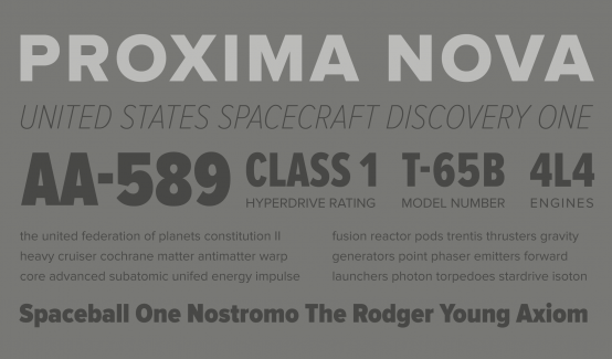
Proxima Nova is one of the most popular web fonts, in use on thousands of websites around the world.. Its created by Mark Simonson. Proxima Nova bridges the gap between typefaces like Futura and Akzidenz Grotesk. The result is a hybrid that combines modern proportions with a geometric appearance.
Link :
https://typekit.com/fonts/proxima-nova
https://www.myfonts.com/fonts/marksimonson/proxima-nova/
Europa
Europa is a modern sans serif typeface combining geometric reduction and humanistic vitality. Its name refers to the inspirational origins and main influences, two popular European typefaces: the geometrical sans serif Futura and the humanistic sans serif Gill Sans.
Link:
https://typekit.com/fonts/europa
Brandon Grotesque
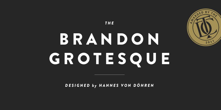
Brandon Grotesque has a functional look with a warm touch. While the thin and the black weights are great performers in display sizes the light, regular and medium weights are well suited to longer texts. The small x-height and the restrained forms lend it a distinctive elegance.
Link :
https://typekit.com/fonts/brandon-grotesque
https://www.myfonts.com/fonts/hvdfonts/brandon-grotesque/
Avenir
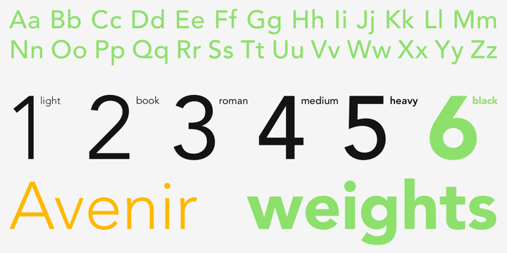
The word Avenir means “future” in French and hints that the typeface owes some of its interpretation to Futura. But unlike Futura , Avenir is not purely geometric; it has vertical strokes that are thicker than the horizontals, an “o” that is not a perfect circle, and shortened ascenders. These nuances aid in legibility and give Avenir a harmonious and sensible appearance for both texts and headlines.
Link :
https://www.myfonts.com/fonts/linotype/avenir/
http://www.fonts.com/font/linotype/avenir
http://www.fonts.com/font/linotype/avenir-next
Roboto
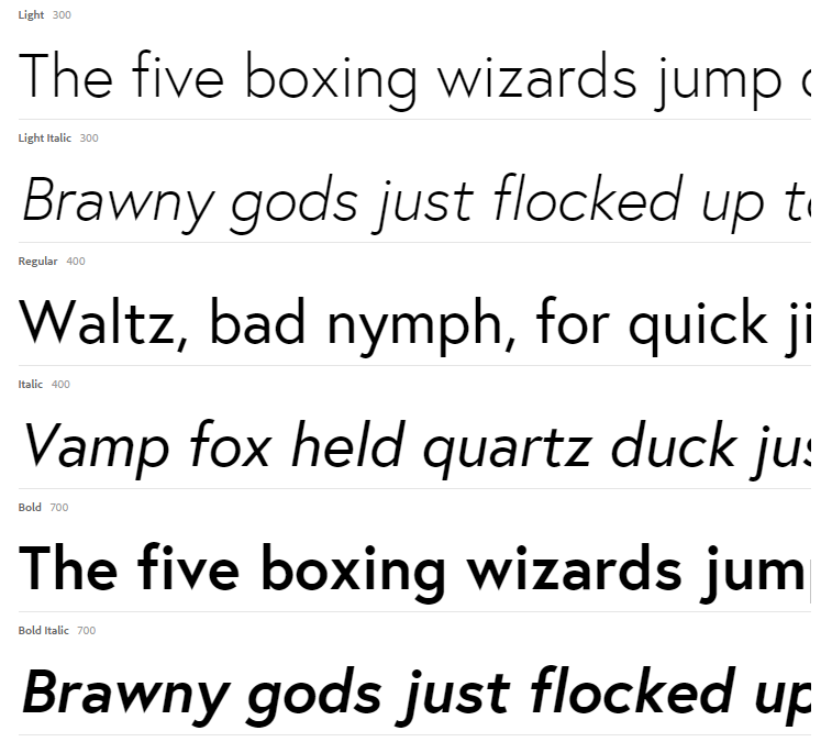
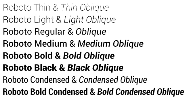
Roboto is a neo-grotesque sans-serif typeface family developed by Google as the system font for its Android operating system. Google describes the font as “modern, yet approachable” and “emotional”. The font is licensed under the Apache license. The entire font family was officially made available for free download on January 12, 2012, on the newly launched Android Design website. The family includes Thin, Light, Regular, Medium, Bold and Black weights with matching oblique styles. It also includes condensed styles in Light, Regular and Bold, also with matching oblique designs.
Link :
http://www.google.com/fonts/specimen/Roboto
http://typecast.com/preview/google/Roboto
Raleway
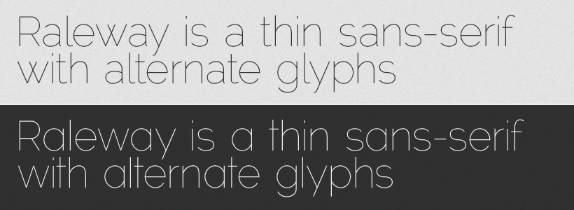
Raleway is an elegant sans-serif typeface, designed by Matt McInerney in a single thin weight. It is a display face that features both old style and lining numerals, standard and discretionary ligatures, a pretty complete set of diacritics, as well as a stylistic alternate inspired by more geometric sans-serif typefaces than it’s neo-grotesque inspired default character set.
Link:
https://typekit.com/fonts/raleway
http://www.google.com/fonts/specimen/Raleway
Serif Fonts
Adobe Garamond Pro
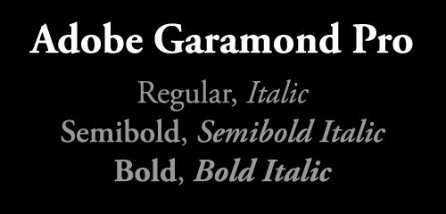
The Adobe Garamond™ font family is based upon the typefaces first created by the famed French printer Claude Garamond in the sixteenth century. This serif face was created by Robert Slimbach and released by Adobe in 1989; its italics are influenced by the designs of Garamond’s assistant, Robert Granjon.
Link :
https://store1.adobe.com/…/
http://www.fonts.com/font/adobe/adobe-garamond
Baskerville
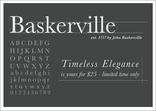
John Baskerville spared no effort to create the ultimate typographic book. He prepared deep black inks and smoothed paper to show to full effect the letters that he had John Handy cut from his own brilliant designs, based on a lifetime of calligraphy and stonecutting. Punches and matrices survive at the Cambridge University Press.
Link:
https://www.myfonts.com/fonts/bitstream/baskerville/
Merriweather
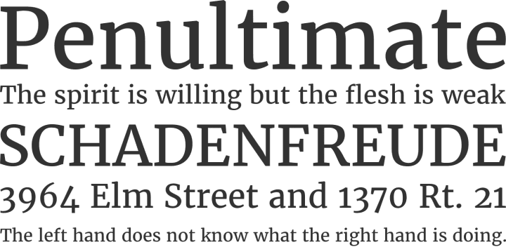
Merriweather was designed to be a text face that is pleasant to read on screens. Designed by Eben Sorkin, Merriweather features a very large x height, slightly condensed letterforms, a mild diagonal stress, sturdy serifs and open forms.
Link:
http://www.fontsquirrel.com/fonts/merriweather
http://www.google.com/fonts/specimen/Merriweather
Crimson Text
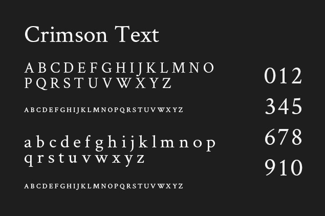
Crimson Text is a font family for book production in the tradition of beautiful oldstyle typefaces. There are a lot of great free fonts around, but one kind is missing: those Garamond-inspired types with all the little niceties like oldstyle figures, small caps, fleurons, math characters and the like.
Link:
https://www.google.com/fonts/specimen/Crimson+Text
That’s all for now. We will update this post once we get more informations on other fonts. If you have any suggestions, Please let us know in the comments.
