Brand identity is the sum of brand design and content. Principles, best practices and guidelines in the field are countless. For designers, these are all topped by their ability to master and send a brand message to a public that quickly responds to it. Identity shapes UX and takes it further with any campaign that supports the brand. Design seniors and juniors can find inspiration in brands that developed and pursued their brand identity until they reached the worldwide brand power top 3. Google is the second strongest global brand after Apple. The brand has 21 years of activity and it constantly develops, releases products and acquired other brands. Let’s see 7 things you can learn about brand identity from Google and even consider them for your own work.
1. Market Adaptation
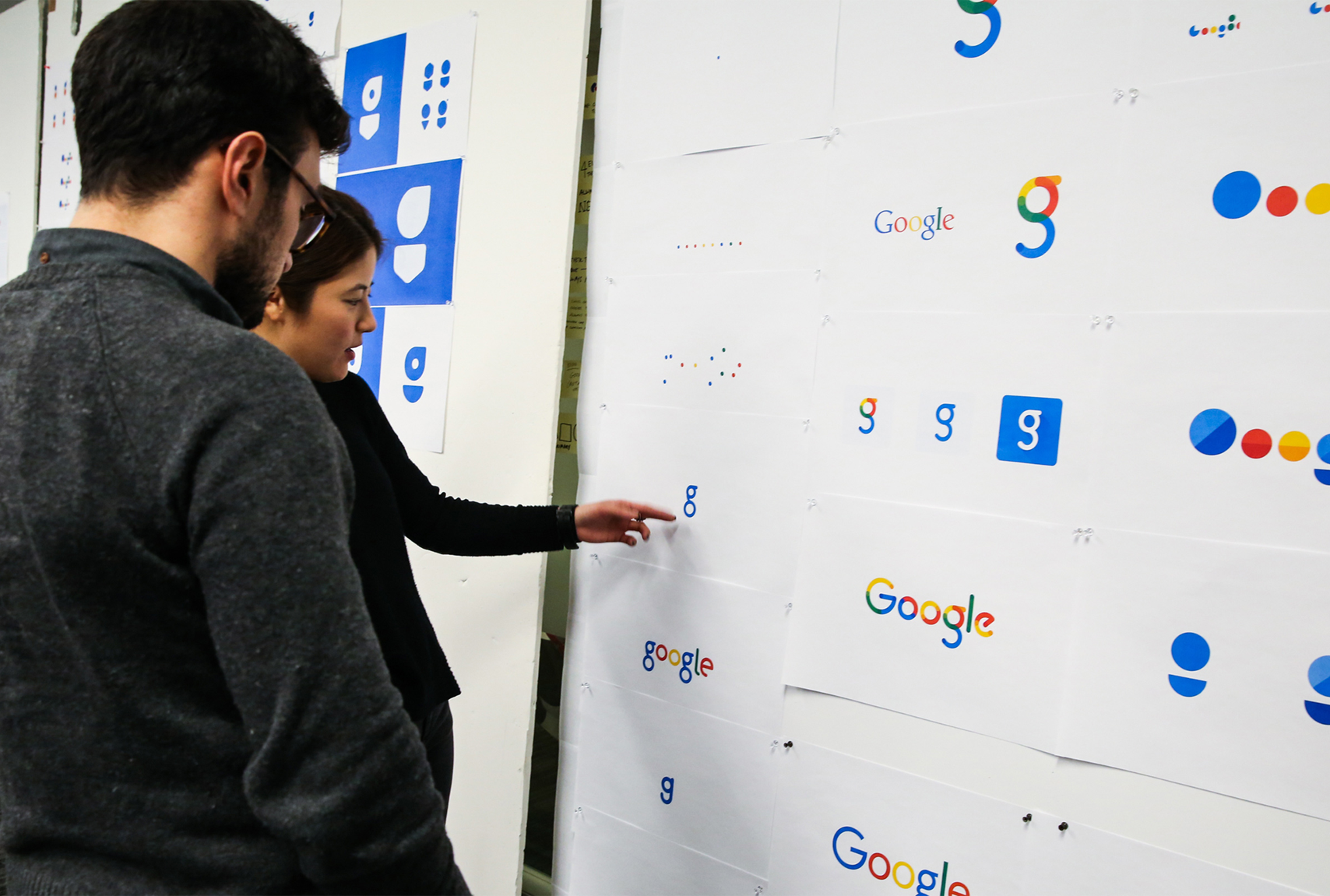
The classic Google logo history is filled with lessons to be learned about brand identity and evolution. The first one starts back in 1997, when Google Beta appeared. The brand had a logo which now may seem obsolete, but it reflected the visual market back then. However, graphic designers developed the logo using an online free design platform called GIMP. Today, this is just a spicy detail in Google’s history. The platform opened doors to visual experts and helped them develop a visual identity of a fresh brand. Don’t be afraid to dig for possibilities, programs or tools beyond the obvious one, if you have an idea.
2. Adjustment
Google featured a logo in 1998 which contained an exclamation mark at the end. This resembled Yahoo’s logo and the other brand also featured its own search engine and mailing service. Designers eliminated the exclamation mark in less than a year, without announcing the change. That adjustment also included a color change to one of Google’s letters. Adjustments are essential, especially if the logo has common elements to another brand’s visual identity. You can include other adjustments without making a branding show out of them, even though the change will be noticed. There are high chances that it will also be appreciated.
3. Motion
Do you know the Google dots? The brand decided to personalize its entire UX and include dots which use the visual identity colors. These dots can also move. Yet, how does this help the brand? Users recognize the platform they’re on and the brand gets an extra point of visibility. Technology now offers plenty of design possibilities. By adding motion into elements from the users’ experience with the brand, you can receive a warming user salute for your idea. When looking at the customer journey map inside your website or brand, think of all the elements that can be personalized without crowding the space. Then, start creating an interactive and assisting design!
4. Compacting
The condensed version of the brand’s logo is a G which is fit for all compact areas. The logo can fit in small contexts and is recognizable due to its color and trademark. A compact version of your logo reinforces the brand’s visibility in places where an entire logo would not look simple and friendly. A monogram emphasizes elements from the brand’s identity and makes it suitable in a less visible square. Some designers claim that any version of a G would have worked as a monogram. Yet, Google decided to feature the brand’s colors. This is a brand identity statement that users usually remember.
5. Development
Google search engine differs from the Google corporations. Alphabet is the parent company of Google Inc. and its subsidiaries. The company has a tagline (even though Google hasn’t), a separate set of values, vision and mission and an apparently different logo. To show the connection to its product, Alphabet and Google’s logo use the same font. Brand identity must respond to its users’ needs. Hence, the need to develop an entirely different brand for Google’s employees. While the public was not influenced by the decision, Alphabet users gained their own brand. Besides consistency purposes, the corporation font sent a message of familiarity.
6. Blending
There’s a difference between a brand and its products. There’s the Google search engine and other products developed by the company. Some of them are Google Maps, Google Wallet, Google Trends, Google Voice and Gmail. These are extensions which drive even more brand recognition. Extended products that support the main one strengthen the brand among its users and contribute to its reputation and reliability. Think about blending products to create an overall uniform image.
7. Lack of Advertising
Branding is not advertising. Google is the greatest example here, as there are no ads or billboards to promote the Google search engine. Some Google products are advertised online. According to the Search Engine Watch, Google spent 1.2% of its revenue on advertising in 2011. Though Google is advertising-free, it did manage to create revenue from its own advertising services.
Brand identity is not for advertising purposes. When you decide to create an ad, you personalize it for potential users or those who don’t already know a new extension or product of your brand. Remember that advertising needs to enforce the brand’s visibility, so there’s no need to adjust the visuals.
Conclusion
Google seems to have reached all the targets it ever had. The brand is an all-time lesson of identity, consistency, visibility and recognition. It’s friendly, interactive and simple. Yet, Google has a lot to offer to designers, even the possibility to occasionally contribute with their own Doodles or ideas. This comes as a bonus: once your brand becomes worldwide known, why shouldn’t you play with its visuals and make them playful?