In tandem with web development, web designing plays a vital role in the success or failure of a website. Falling into the trap of DIY to web designing or anyone can become a web designer is easy these days; especially when you have information regarding the same in a dime a dozen. Although the concept of what a perfect website looks like is subjective- if person A likes a design, person B might find it hideous. I personally find web design as one of the most crucial factors for judging a company’s credibility.
Picture this situation; where a customer hears about your business but before contacting you they simply look at your website. As usual, they get turned off as they are not at all impressed with your website design. So what they do is, they take their business somewhere else. Like it or not, the story has been a sad reality for many businesses. But that doesn’t mean you cannot have control over this.
As soon as a customer lands on your website, check whether is he able to determine what exactly your company does? Are the users easily able to navigate to the blog or is the layout of your pricing easy to understand? If all the answers are yes, then there is nothing to worry about. But if the answer is no then there its time you must take a hard look at the way you have been designing and optimizing your website. However, succeeding in a limited number of aspects somewhat like design or content won’t be able to create a win-win situation for you. Your website should be interactive featuring a rare capability of communicating flawlessly with your end-users. It’s easy to get caught up with how great you are as a business that you forget to make sure we are addressing core concerns your audience has first and foremost.
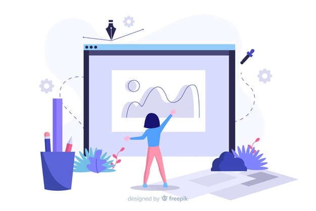
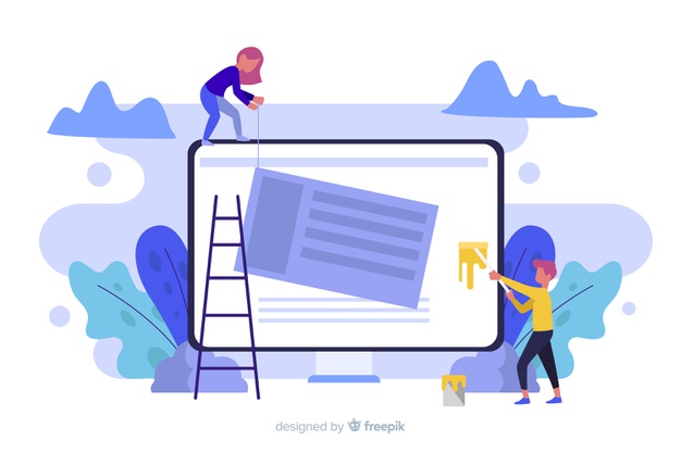
So what makes your website pretty? Is it the flash or do you require being a great illustrator to come up with appealing designs? None of these! In fact, it might interest you to know that no single element counts the most; rather, the sum of the elements makes a perfect design.

[Image Source- Freepik]
Why learning fundamentals is important, even for experienced designers?
UX designing in itself is a vast field comprising of interaction designer, product designer, service designer, UI designer and so more. However, the label doesn’t matter but what matters the most is that are you doing in the right manner? According to me, this is quite an overlooked fact; you even as an experienced web designer contribute in the process without knowing what’s under the hood. And that’s the reason why we fail in making certain informed decisions.
Of course understanding the basics and the capabilities of the design realm is at great paramount. Right from the main technical constraints to limitations and the most important development aspects can be beneficial for any designer. In addition to this, there are certain fundamentals- far from complete to consider: –
- Stay Curious, no matter how experienced you are have this will to learn new things
- Have a good understanding of how todays products are complex and humans are way beyond.
- First ideas are not necessarily the best ones
- Keep a broader perspective- always look at the big picture
- Handle uncertainty without panicking
- Acknowledge your mistakes
Further I would like to mention some of the most effective web design tips you must know.
Make a positive first impression
Within a span of seconds, your audience requires to get across who are you and what you can do for them. So when someone visits your page, you want to hook them in the right way to hold on to that!
Use short content explaining what you exactly do and highlight the benefits. Also, you must consider sectioning off with brief, clear headers. And using a visible call to action to increase conversion.

[Image Source- Freepik]
With such little time and space to hook, it is very important to prioritize your content by telling that what problem you can solve for them in the first place, then explain how will you do things after that.
Keep your design balanced
I am sure you must knowing what I want to say in keeping your design balanced. To put in simple words, your design does not tip to one side or other. It’s more like achieving some kind of symmetry. If you are not careful about how you lay things out there your audience won’t care for you either. Visual design can be balanced in several terms especially in regards to weight, color, size and the addition or removal of elements. On and all, it takes time to fine-tune and a somewhat trained eye to really pull off.
Less is more
Here’s another one, the simpler the better! According to the paradox of Choices, the more options you give people, the easier it becomes for them to choose nothing at all. And this has never been truer than in web design. Having a plethora of options can overwhelm visitors and drastically increase the amount of time it takes for them to make a decision.
Always keep this in mind, users came to your site with a purpose in mind and of course, it has nothing to do with admiring your beautiful graphic design skills. However, fancy layouts can be visually appealing but you never want your graphics to distract users from finding what they came to your website for in the first place.
So what you need to do is, take a brief look at your space. Do you find any excessive amount of information which you don’t need at all? If so, simply Clt-Alt-Delete. Don’t waste precious real estate on your website with unnecessary decorations. Simple, sleek designs have proven long-lasting and sure to withstand the test of time.
I hope you liked going through the basics. However, basics don’t have to mean amateur. In fact, with these web design tips, your website will show how polished and professional your business truly is. So, what are you waiting for? Time to get started on your website today!
Author Bio
Dave Jarvis is working as a Business Development Executive at – eTatvaSoft, a web design and development company and you can know more about the company from here. He aims to sharpen his analytical skills, deepening his data understanding and broaden his business knowledge in these years of his career. Follow him on Twitter.


