Trace Web Design Evolution with Interactive Web Design Trends 2004-2015
Do you remember how excited you were when you first accessed the Internet? Or maybe you can recollect your first blog design, complete with animated GIFs, frames and flash elements? Now cast a glance at a modern website. Can you see the difference? It’s absolutely amazing how much has changed over the years. The Internet looks completely different today to the way it did when the first web sites went online. It seems designers will never become tired of treating their online audience to absolutely unique ways of presenting information. And we are just glad constantly to be discovering something new and appealing.
There is no tomorrow without the past, so we should always keep in mind what existed at the onset of modern web design. When and how did it begin? Which styles and techniques were trend-setters a decade ago? It’s virtually impossible to find a place where all the main web design trends that were in demand during the past decade are gathered. However, TemplateMonster has attempted to gather all web design trends into one Infographic, and, frankly speaking, these guys have succeeded.

The interactive Infographic looks both simple and appealing. Designed to be fully responsive, you can browse it from both desktop and handheld devices. When you reach its main page, you’ll be introduced to the list of years and web design trends presented in the vertical accordion slider. By clicking any cell, you’ll be taken to the page featuring five trends that were especially popular during a particular year. Click any thumbnail and a popup window with a brief description and several examples displaying how the trend was presented online will appear. The Infographic is truly interactive, letting you dip into the world of web design.
As you’ve already guessed, the Infographic highlights 12 years of web design history. Here everything commences with the year 2004, when five basic trends were in the highest demand, namely:
- Cluttered layouts – web pages where elements were organized in a chaotic order, although there was a particular reason for organizing information in such a way, as a rich variety of useful information could grab user attention and provide a positive experience.
- Restrained, pale color schemes were used to diversify cluttered layouts with something different, and pleasant to the eye. This created a calming effect on viewers, without distracting their attention.
- Flash sites were in demand for quite a long time. These were the predecessors of HTML5, CSS3 and jQuery that are so popular nowadays. Flash sites were visually attractive and interactive, manipulating vector and raster graphics to provide animation of text and still images.
- Starburst effect was used to enliven backgrounds and add some retro charm to web designs.
- Patterns and textures were used to bring special charm and to decorate backgrounds with catching visual elements.
These were web design trends that were especially popular when the Internet was starting to gain popularity. Now, let’s have a look at styles and techniques that literally invaded the web in 2014. If you open the corresponding page in the Infographic, you will come across the following five trends:
- Code-free designs that are created by means of website construction programmes allowing you to create a site of your dreams without any assistance.
- Full-width pages are proven trend-setters in the modern age. As the name suggests, such web pages make use of full-width sliders and background images, making it easier to appeal to the audience and bring your message to the forefront.
- Modern web designers tend toward simplicity. Simplification is a win-win solution if you want to add special emphasis to your message and make content readable across multiple devices.
- Non-standard navigation is next on the list. If you come across a website that moves unlike the way to which you are used, you can be sure you’ve reached a web resource with non-standard navigation. Some pages like those are more usable thanks to the bottom navigation, others, on the contrary, are less usable, like the cases where you need to use arrows to get around the site.
- Blocking is a technique that is in special demand among online portfolios and inspiration ‘pinning’ websites. Such websites have a number of blocks of identical size for presenting different information.
This was a brief overview of popular web design trends that existed at the inception of modern web design as well as the basic elements that are currently applied to present information in a more appealing and interactive way.
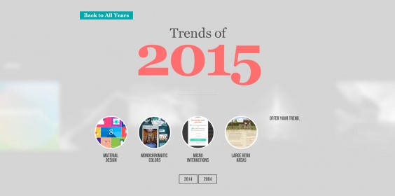
And what about the current year? Do you want to look into the future and see what design trends will be ruling the web in 2015? Web Design Trends Infographic shares predictions for this year. Some of them are already becoming more and more popular. Here are some of them:
- Material design is a special design style first introduced by Goggle and in that way it started to become more and more popular. It uses grid-based responsive layout, animations and padding. One of the most prominent features of material design is lighting and shadowing that create its special feel and aesthetics. Material design is promised to be a general tendency in this year.
- Monochromatic colors have been popular for some time earlier in the history of web design, but in this year the interest of web designers has been drawn to them once more. With monochrome colors an object, picture, or a web page will have only one basic color and some variations of it, including shades and hues. Thanks to monochromatic color-scheme your website will have a stylish appearance that can mesmerize your visitors at a first glance.
- Large Hero Areas is a trend that has become a ‘visit card’ of the new decade of web design. Hero image is a specific type of a web banner that is often the first thing a visitor encounters on a web page. It mostly consists of a high-resolution image and text with distinctive typography and makes the website pleasing to the eyes of others and more eye-catching. May also include a call-to-action button, or a ghost button that stimulates visitors to click it.
If you want to learn more and have a closer look at all web design trends that were popular during the last decade, please click here.
Also you could have already guessed that each year mentioned in the Infographic, features five main trends, unlike 2015. Here you will find only four suggestions. TemplateMonster offers you an opportunity to contribute to the further development of their Infographic by suggesting the fifth web design trend that you think will be in demand this year.
So, go ahead, view the Infographic, trace the evolution of web design and don’t forget to leave your suggestions under this post!
About the author:
Written by Katherine Crayon, copywriter reporting on tech news and all aspects of the web design industry. Anyone looking for a magic kicker to get your own online business started meet her in person on G+ and Twitter.


