Previously, we have shared the Best Fonts for Designers and 20+ Vintage fonts for Inspiration. Today, we are sharing our handpicked list of best Google fonts. Google Fonts is an awesome service which makes life easier for designers and developers. The integration of web fonts has always been one of the largest contributing factors to diversity in the overall look and feel of websites today; Google Fonts library has over 600 font families. I have chosen the selected fonts based on quality, legibility, versatility, and number of available styles and weights.
Sans Serif Fonts:
#1 Roboto
Roboto designed by Christian Robertson and is the official font family of the Android operating system. Roboto comes in 12 styles. The font features friendly and open curves. Goal of this font was not to allow distorted letterforms to force a rigid rhythm. Commonly found in humanist and serif types.
This is the regular family, which can be used alongside the Roboto Condensed family and the Roboto Slab family.
#2 Open Sans
Open Sans designed by Steve Matteson and comes in 10 different styles. Includes the standard ISO Latin 1, Latin CE, Greek and Cyrillic character sets. Open Sans designed with an upright stress, open forms and a neutral, yet friendly appearance. Also optimized for print, web, and mobile interfaces, and has excellent legibility characteristics in its letterforms.
#3 Lato
Lato designed by Łukasz Dziedzic and includes 10 styles. (“Lato” means “Summer” in Polish). Large sized letters in Lato have some unique curves. Semi-rounded details of the letters give Lato a feeling of warmth, while the strong structure provides stability and seriousness.
#4 PT Sans
PT Sans designed by ParaType developed for the project “Public Types of Russian Federation” meant to make displaying text in multiple languages uniform. Font is good for multiple purposes and it consists of 8 styles: 4 basic styles, 2 captions styles for small sizes, and 2 narrows styles for economic type setting.
#5 Raleway
Raleway, an elegant sans-serif typeface family intended for headings and other large size usage. Initially designed by Matt McInerney as a single thin weigh, later expanded into a 9 weight family.
It also has a sister family, Raleway Dots.
#6 Josefin Sans
Josefin Sans is a narrow, san-serif font with several options in width designed by S
antiago Orozco. It consists of 10 different styles. There is a sister family,
Josefin Slab.
#7 Montserrat
Montserrat was designed by
Julieta Ulanovsky. The old posters and signs in the traditional Montserrat neighborhood of Buenos Aires inspired her to design this typeface. It has 18 styles. This is the normal family, and it has two sister families Alternates and Subrayada. #8 Droid Sans
Droid Sans designed by Steve Matteson and has only 2 styles. Friendly, open, and multi-purpose font meant to be readable across various web devices, on the web page, and in web menus.
#9 Source Sans Pro
Source Sans Pro, Adobe’s first open source typeface family, was designed by Paul D. Hunt to work well in user interfaces. It comes in 12 different styles. This will make a great menu font but can also be used for other things such as body text.
#10 Arvo
Arvo is a geometric slab-serif typeface family suited for screen and print designed by Anton Koovit. It is another geometric typeface. Intended to be a “mixed” type good for multiple purposes. Used for titles, headlines, and body text.
#11 Poppins
Poppins is designed by IndianType Foundry. It is an open source family supporting both Devanagari and Latin writing systems, this typeface is geometric. It has 5 styles. Each letterform is nearly monolinear, with optical corrections applied to stroke joints where necessary to maintain an even typographic color.
#12 Muli
Muli is designed by Vernon Adams mainly for use as a display font but is useable as a text font too. Also used freely across the internet by web browsers on desktop computers, laptops and mobile devices. It comes in 14 different styles.
#13 Questrial
Questrial a perfect font for body text and headlines on a website designed by Joe Prince. The full-circle curves on many characters make Questrial to blend seamlessly with other fonts. Numbers are tabular figures and is used in tables and forms.
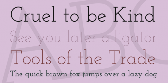
Serif fonts:
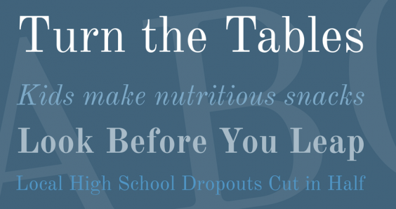
#1 PT Serif
PT Serif, a universal type family designed to use with humanistic terminals and harmonized across metrics, proportions, weights and design. Also the second pan-Cyrillic font family developed for the project ‘Public Types of the Russian Federation’. The family consists of six styles and 2 caption styles in regular and italic are for use in small point sizes.
#2 Josefin Slab
Josefin Slab, an open-source slab serif typeface designed by Santiago Orozco. It has 6 styles matching italics from Google Fonts. It also has some typewriter style attributes. The low x-height doesn’t make it the best font for body copy, however it makes an excellent display and headline font.
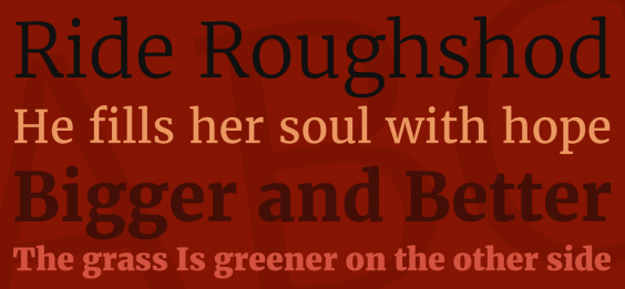
#3 Abril Fatface
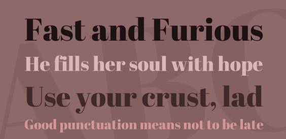
Abril Fatface, a large typeface family designed by TypeTogether. Inspired by the heavy titling fonts used in advertising posters in 19th century Britain and France. This font is probably best for titles and headlines. It displays both neutrality and strong presence on the page to attract reader attention with measured tension by its curves, good colour and high contrast.
#4 Playfair Display
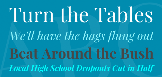
Playfair Display designed by Claus Eggers Sørensen and is well suited for titling and headlines. Also an extra large x-height and short descenders are present. Capitals are extra short, and only very slightly heavier than the lowercase characters. Font files include a full set of small caps, common ligatures, and discretionary ligatures. It has 6 different styles.
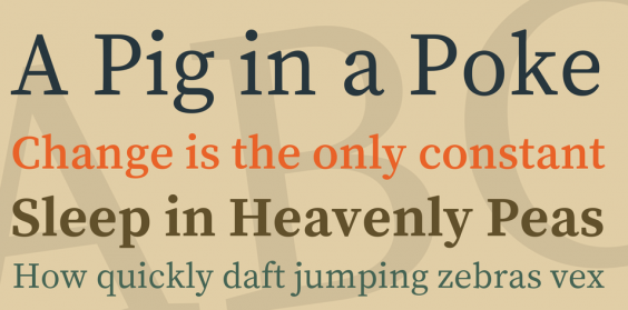
#5 Vollkorn
Vollkorn designed by Friedrich Althausen and has 4 styles. Specifically used for web and print matters. Besides it can be used as body type as well as for headlines or titles.
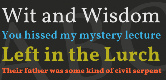
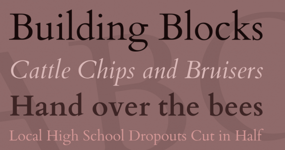
#6 Old Standard TT
Old Standard TT designed by Alexey Kryukov and comes in 3 styles. Namely meant to be reminiscent of body text in old books. Hence well suited for article writing.
#7 Cardo
Cardo designed by David Perryand comes with 3 styles. Above all cardo designed for the needs of classicists, Biblical scholars, medievalists, and linguists. However it works well for general typesetting in situations where a high-quality Old Style font is appropriate. Besides used for ligatures, text figures (also known as old style numerals), true small capitals and a variety of punctuation and space characters.
#8 Source Serif Pro
Source Serif Pro created by Frank Grießhammer for Adobe Systems. It comes with 3 styles. It is a set of OpenType fonts to complement the
Source Sans Pro family.
#9 Merriweather
Merriweather created by Sorkin Type designed to be a text face that is pleasant to read on screens. It comes with 4 styles. Merriweather features a very large x height, slightly condensed letterforms, a mild diagonal stress, sturdy serifs and open forms.
#10 Cambo
Cambo created by Huerta Tipográfica. It is a modern Latin typeface inspired by the contrast, style and ornaments of Khmer typefaces and writing styles. Its main objective is to write Latin texts in a Khmer context, but it is also an elegant choice for all kinds of texts.
This is no means a complete list and we definitely encourage you to browse Google Web Fonts and build your own list of favorites. What is you favorite Google Web font for headlines? What about for content (body text)? If you think we’ve left out an awesome Google font, make sure to leave us a comment below.
PS: A big shout out to http://www.1001fonts.com/ for providing the images.