Bootstrap 5 is in Alpha Stage and we are all excited about this news as this new update from Bootstrap ships a lot of new features as well as breaking changes from the old version. So we should be very careful when updating your Website or Application to the new version.
Table of Contents
If you want to skip the new v5 features, Jump to Upgrade Guide
What’s new in Bootstrap 5
Before we talk about how we can upgrade our website to new version, first let’s checkout the new features of Bootstrap v5.
1. RIP jQuery
Yes. This is the first highlight of Bootstrap 5. It does not ship with jQuery by default. However they are not making the mistake by completely removing it. Instead Bootstrap now provides an option for users to include jQuery if they wish.
All of their components are now powered with Pure Vanilla Javascript. Thanks to the modern front-end development tools and browser support. Here’s what their creators said about dropping jQuery as a dependency.
Personally, I’m forever grateful for the empowerment and support it gave me to continue writing front-end code. it’s forever changed JavaScript itself. Thank you to every jQuery contributor who made that possible for folks like me.
@mdo & team
2. CSS Variables
Since they dropped the support for Internet Explorer, It was easy for them to implement the new CSS Custom Properties that everyone wished for. The distance between SASS and CSS are now reducing day by day.
No more complex installation and compilation just to store some color variables. Yay!!! Here’s how it looks like:
:root {
  --bs-blue: #0d6efd;
  --bs-indigo: #6610f2;
  --bs-purple: #6f42c1;
  --bs-pink: #d63384;
  --bs-red: #dc3545;
  --bs-orange: #fd7e14;
  --bs-yellow: #ffc107;
  ...
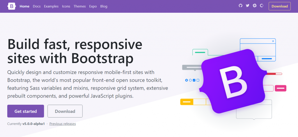
3. Improved Docs
That’s where we spend most of our time. And new Bootstrap 5 has an improved docs. More explanation and new Customize section.
4. Color Palettes
v4 shipped with limited colors. We had to manually create colors for our project because the stock one didn’t fit most of our use cases. But Bootstrap v5 comes with a lot of colors. Really a lot. 100+ color variations are now available to choose from in the new Boostrap 5.

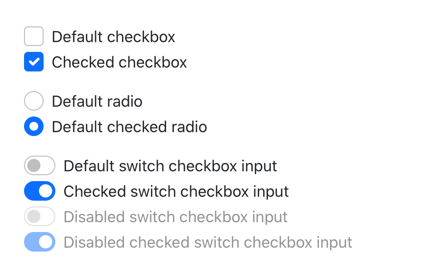
5. Updated Forms
Another revamped area is the form section. It has now new styled components and form controls. Checkboxes are radio boxes are now custom by default. No more .custom- classes needed.
6. Utilities API
Since the popularity of Tailwind CSS, Bootstrap 4 is also giving more options to create utilities. They have built a brand new Utility API to the new version.
7. Grid System
Yes. its still flex based and they have not implemented the CSS Grid yet, but as per their announcement they plan to do so in the future. Since it will be a breaking change. They are very careful about this.
CSS Grid Lovers have to wait longer ?
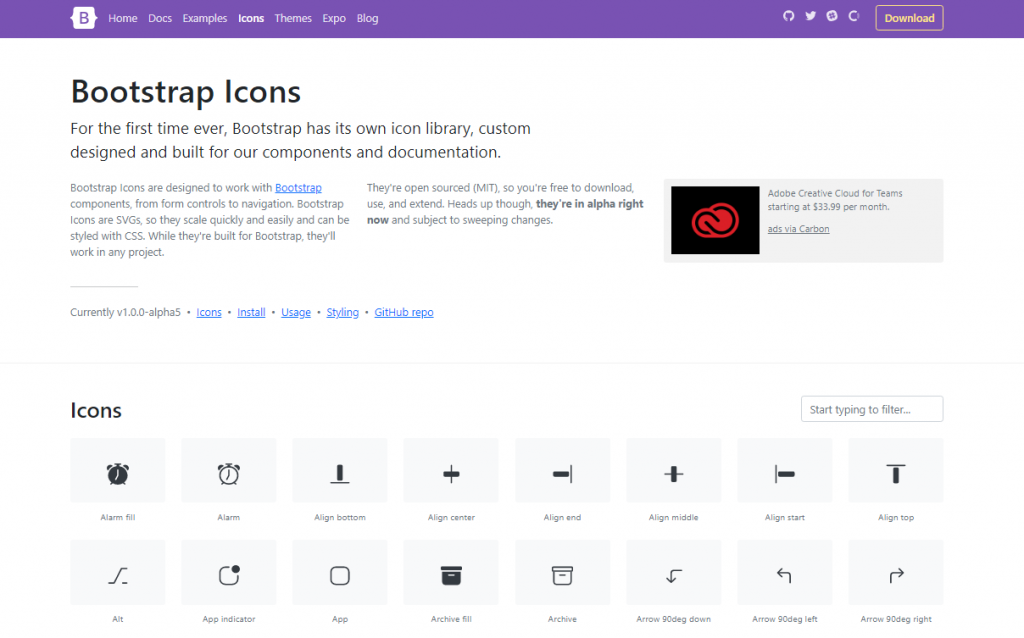
8. Bootstrap Icons
Even its not related to the new version, but Bootstap has now their own open sourceIcons library called “Bootstrap Icons“. Be sure to check them out .
9. Coming Soon
At the time of the writing v5 is still in the Alpha Stage. As per their announcement, there are more to come. Features like Official RTL Support (finally!!!), Offcanvas and more are in the pipeline. Be sure to checkout their Github page for more info.
Upgrade Bootstrap 4 to 5
We will list main changes in the bootstrap v5 and then we will show you how you can modify & update it to make it compatible with new Bootstrap 5 version.
Dropped .media Object
This is a breaking change as Bootstrap 5 does not ship with .media object. However it can be easily converted to bootstrap 5 using the utility classes. See the code below.
<!-- // Bootstrap 4 -->

<div class="media">
  <img src="..." class="mr-3" alt="...">
  <div class="media-body">
    <h5 class="mt-0">Media heading</h5>
    Media Content ...
  </div>

<!-- // Bootstrap 5 -->

<div class="d-flex">
  <img src="..." width="144" height="144" class="flex-shrink-0 mr-3" alt="...">
  <div>
    <h5 class="mt-0">Media heading</h5>
    Media Content ...
  </div>
</div>
Custom Checkboxes and Radio
Previously in Boostrap 4, there were two options for checkboxes. Default and Custom. In v5, they merged in to one.
<!-- // Bootstrap 4 -->

<div class="custom-control custom-checkbox">
  <input type="checkbox" class="custom-control-input" id="customCheck1">
  <label class="custom-control-label" for="customCheck1">Custom checkbox</label>
</div>

<!-- // Bootstrap 5 -->

<div class="form-check">
  <input class="form-check-input" type="checkbox" value="" id="flexCheckDefault">
  <label class="form-check-label" for="flexCheckDefault">
    Default checkbox
  </label>
</div>
File Browser
Updated file input component with the same overall design, but improved HTML. Refactored .form-file markup to resolve some visual bugs while allowing translation and button text changes via HTML instead of CSS.
Dropped native .form-control-file and .form-control-range components entirely. Renamed .custom-file to .form-file (including variables).
<!-- // Bootstrap 4 -->

<div class="custom-file">
  <input type="file" class="custom-file-input" id="customFile">
  <label class="custom-file-label" for="customFile">Choose file</label>
</div>

<!-- // Bootstrap 5 -->

<div class="form-file">
  <input type="file" class="form-file-input" id="customFile">
  <label class="form-file-label" for="customFile">
    <span class="form-file-text">Choose file...</span>
    <span class="form-file-button">Browse</span>
  </label>
</div>
Dropped .form-group
Form group class .form-group has been removed in bootstrap 5 in favor of margin utilities. This is one of the the most used bootstrap class. So make sure to change it as per the code below.
<!-- // Bootstrap 4 -->

<div class="form-group">
    <label for="email">Email address</label>
    <input type="email" class="form-control" id="email" placeholder="...">
</div>

<!-- // Bootstrap 5 -->

<div class="mb-3">
<label for="email" class="form-label">Email address</label>
<input type="email" class="form-control" id="email" placeholder="...">
</div>
Dropped .input-group-append & prepend
Dropped .input-group-append and .input-group-prepend. You can now just add buttons and .input-group-text as direct children of the input groups.
<!-- // Bootstrap 4 -->

<div class="input-group mb-3">
  <div class="input-group-prepend">
    <span class="input-group-text">$</span>
  </div>
  <input type="text" class="form-control" aria-label="Amount (to the nearest dollar)">
  <div class="input-group-append">
    <span class="input-group-text">.00</span>
  </div>
</div>

<!-- // Bootstrap 5 -->

<div class="input-group mb-3">
  <span class="input-group-text">$</span>
  <input type="text" class="form-control" aria-label="Amount (to the nearest dollar)">
  <span class="input-group-text">.00</span>
</div>
Dropped Card Columns & Deck
Removed the card columns in favor of a Masonry grid. Removed card decks in favor of the grid which adds more flexibility over responsive behavior.
? Example of new Card Columns with Masonry.
See Below: Example Code for Card Deck v4 / Card Group v5
<!-- // Bootstrap 4 -->

<div class="card-deck">
  <div class="card">
    <img src="..." class="card-img-top" alt="...">
    <div class="card-body">
      <h5 class="card-title">Card title</h5>
      <p class="card-text">This is a longer card...</p>
      <p class="card-text"><small class="text-muted">3 mins ago</small></p>
    </div>
  </div>
  <div class="card">
    ...
  </div>
  <div class="card">
   ...
  </div>
</div>

<!-- // -------------------------------------------------------- // -->
<!-- // Bootstrap 5 -->

<div class="card-group">
  <div class="card">
    <img src="..." class="card-img-top" alt="...">
    <div class="card-body">
      <h5 class="card-title">Card title</h5>
      <p class="card-text">This is a wider card...</p>
      <p class="card-text"><small class="text-muted">3 mins ago</small></p>
    </div>
  </div>
  <div class="card">
    ...
  </div>
  <div class="card">
    ...
  </div>
</div>
Dropped .jumbotron
The jumbotron component is removed in favor of utility classes like .bg-light for the background color and .p-* classes to control padding.
<!-- // Bootstrap 4 -->

<div class="jumbotron">
  <div class="container">
    <h1 class="display-4">Jumbotron</h1>
    <p class="lead">This is a modified jumbotron...</p>
  </div>
</div>

<!-- // Bootstrap 5 -->

<div class="bg-light p-3">
  <div class="container">
    <h1 class="display-4">Jumbotron</h1>
    <p class="lead">This is a modified jumbotron...</p>
  </div>
</div>
Navbar needs .container
From Bootstrap 5, All navbars now require a container within. This drastically simplifies spacing requirements and removes the need for extensive CSS overrides we added for responsive containers in v4.
<!-- // Bootstrap 4 -->

<nav class="navbar navbar-light bg-light">
  <a class="navbar-brand" href="#">Navbar</a>
</nav>

<!-- // Bootstrap 5 -->

<nav class="navbar navbar-light bg-light">
  <div class="container-fluid">
    <a class="navbar-brand" href="#">Navbar</a>
  </div>
</nav>
There are more Changes
We have only highlighted Main Changes which will break your layout. However there are lot of other changes you need to checkout before Upgrading or Migrating to Bootstrap 5.
? Check out the Official Migration Docs for More Info
Conclusion
I hope you are able now to easily convert your old Bootstrap 4 project to Bootstrap 5 with this help. If yes. Please share it to your peers who might also need some help. If you have any suggestions, comments or any errors, please let me know in the comments.
Peace ✌
