There are different tools or style libraries that help to create themes with Angular. One of the most famous libraries is Angular Material, which follows the Material Design guidelines, the style guide created by Google for the Android operating system. You can also find ready to use angular material themes to speed up your project.
This library works with multiple components where each of them has a reference API where you can consult the way of use, its style, examples of use, etc. Its documentation is its strong point and makes it very easy to use and implement in each project where you want to improve the appearance with a layer of reference styles such as Material Design.
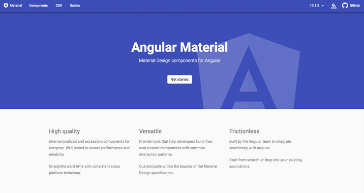
It has multiple components, practically all those that a common website may need: cards, lists, buttons, tables, etc.
This article details the installation process of Angular Material as well as several examples of using components until you get the look of a basic theme or template.
Angular Material: Installation
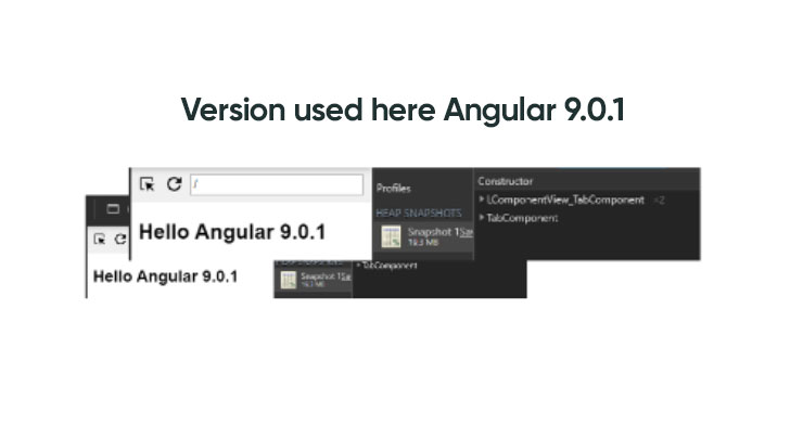
Note: The version of Angular used in this article is 9.0.1
For the installation and use of Angular Material, it will only be necessary to have an Angular project already started, and the library will be installed as a dependency.
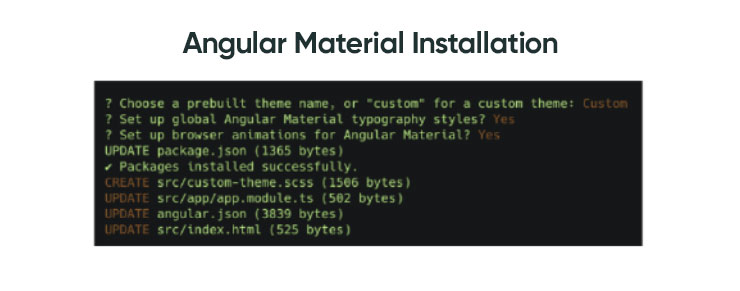
When you run the above command, a list of base theme options appears or else choose the custom theme option by choosing the “Custom” option. The difference between a base theme or customization is that if an example base theme is chosen, a CSS file with predefined styles for all components will be added to the project, while if the “Custom” option is chosen, it will be necessary to define global styles and customize components based on specific needs.
For this article, the “Custom” option is chosen to illustrate how a theme is made from scratch.
To the following questions, about generalizing typography styles and importing animations, answer YES (Yes). This last option will import the BrowserAnimationsModule module into the app.module.ts file.
Use of Components
Once Angular Material is installed, take a look at the documentation to see what components will be necessary for the theme you want to do. In this article, various sample components are used.
To form the visual structure of the template, two columns will be used, the first being the side menu (sidemenu) typical of an internal web application or “admin site”. For this solution, Angular Material incorporates a component called “mat-sidenav”, so you simply have to import the associated module (MatSidenavModule) into the main component (app.component.html) and give it the visual styles that are considered.
By adding the component in question, you will already have default styles, but these are limited (as the “Custom” theme was chosen at the time) so you are given some basic styles. Also added to this main component is the Angular Material component “mat-toolbar” that provides a header. This component allows adding text and / or different elements such as icons, links, etc.
The side menu also includes a list of elements that will serve as a link menu to register different pages with different components each.
Once the skeleton of the theme has been defined, with its side menu and its header with a title, it remains to establish the route format, and make the content of the menu page that has been chosen to appear on the right side. Obviously, the pages (components) that you want to incorporate into the menu must first have been created
Home
This page should be what the dashboard page would be in a theme based on an admin page. For simplicity, since in the other two pages, components will be included, here only a title will be put, without giving it more important. This page only acts as a home page for defined routes.
List
A list has already been used in the menu, so for the project, it would already be imported from the main module (app.module.ts), and it could be used without problem in another angular component. As there are several types, this page uses a different type of list as an example: List with selection. The Angular Material documentation itself incorporates many other examples: List with icons, with the avatar, multiline, etc.
To finish the List page, an Angular Table Material component is added, to display a basic table with rows and columns, to see its usefulness and ease of creation.
As always, first, the module is imported into the main component (app.module.ts) to have it available in the project. The module is called: MatTableModule.
It is necessary to give the table some basic styles to make it larger since by default it only takes the minimum width to display the data.
Form
This page is created to show some examples of form fields. The library provides a great guide to elements of a form such as inputs, selects, date pickers, autocomplete field, etc. Each of them with different customization options.
Following the same steps as always, the modules of those Angular Material components that are needed are registered in the main component (app.module.ts).
Visually Enhancing Content (Extra)
You can visually enhance your content by setting a single container for the content and applying the padding property.
Finally, as a final improvement, titles are established on the remaining pages, List and Form, giving each page a more elegant content and leaving each one ready for the insertion of more visual components.
Conclusions
In conclusion, there are details that could be improved, such as increasing the size of the menu, showing/hiding the menu when hiding, etc., but all these improvements escape the main objective of the article: create a basic theme with Angular Material, which allows you to see what steps to follow to add components and follow the library documentation.
Making a website with Angular using the Angular Material library to help in the realization of visual components, following the documentation and correctly applying CSS styles to the elements is very fast and effective.
Practically everything has been built with Angular Material components, so the library provides examples for all kinds of developments and is very flexible to work with your own styles. The conclusion is that it is a very complete library to make applications with a design based on Android design patterns, which is simple and fast to use.
Banner Design by Maggie Appleton
