As your website will serve as your online storefront 24 hours per day, it is easily your company’s biggest asset. However, due to emerging web design trends and changing consumer behavior, your website could quickly appear old, slow, and outdated.
If you want to convince every visitor to become a customer, you must alter your web design and user experience (UX) when necessary. Find out how to improve your site’s UX to win customers below.
Accelerate Your Site’s Page Speed
Unless you want to frustrate your visitors and lose potential customers, you must aim to accelerate your site’s page speed. Nothing will make them want to click away from your webpage quite like a slow load-time.
If your site takes longer than two seconds to load, expect a high bounce rate and a smaller revenue each day. To speed up your site:
- Compress all images on your website
- Limit redirects
- Enable browser caching
- Change web host
- Defer JavaScript loading
If you can improve your site’s speed, your visitors will be more likely to navigate from page to page and add an item into their shopping cart.
Add White Space
Your website’s layout, colors, and fonts will each have a psychological effect on your visitors. It is imperative to keep your web design both clean and simple, which can make your web content more legible.
To do so, you must design web pages with much white space, which will help your visitors to focus on the surrounding images and copy. It will also ensure your company and website appears fresh and modern. If you’re unsure how to incorporate white space into your site, contact Rogue Media to learn more about a website redesign.
Use Powerful Call to Actions
While your website content will educate your customers on the benefits of your product or service, it is your call to actions (CTAs) that will convince them to act. To encourage them to make a purchase, call your company or fill in a sign-up form, you must incorporate powerful CTAs into your webpages.
As well as helping your customers to navigate across your site with ease and increasing your conversion rate, your CTAs can evoke various messages on your website, such as experience or trust. You must, therefore, choose your words wisely, which is why you should use a verb to indicate what they need to do, such as:
- Sign up now
- Click here
- Get started
- Call today
- Try for free
Carefully Choose Your Images
Modern consumers know a stock photograph when they see one. If you use the generic images on your site, which they might have seen on other websites a thousand times before, a visitor will be less likely to trust in your brand.
What’s more, it can also detract from your high-quality web design and easy navigation, as they’ll be unable to forget the image on a webpage. To improve the user experience and increase your sales, replace a stock photo with genuine, professional images that will complement your branding.
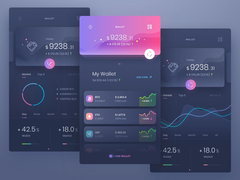
Banner Illustration by Uran


