Retina Image with jQuery
You may have a question like “how to replace images for retina display”. The answer is simple. We can do this in many ways. You can do it with CSS Media queries, with 3rd party plugins like retina.js or with jQuery. I found jQuery is very simple to use in any static websites. So here is a small tutorial on how to Change image for retina display.
How it works
The Script will first check the device whether it is retina display or not. Then it will replace all your images in the HTML with Retina images. Otherwise, do nothing.
File Structure
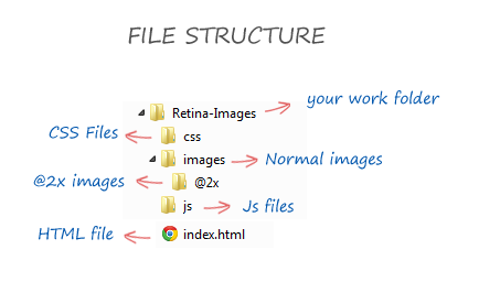
The first thing you have to do is, create a better folder structure. Here our structure is
Setting the Images
After that, you have to copy your normal images into “images” folder and your retina images in to “@2x” folder with the same name.
Ex: if you put dummy.png in “images” folder, you should also keep the same name in “@2x” folder too like dummy.png
Include jQuery Library
Please include jQuery in your </head> section. You can leave it if you already included it.
<script src="http://code.jquery.com/jquery-1.9.1.min.js"></script>
Including Retina Script
Next, Create a blank js file in your “js” folder. Then include it in your <head> section just after the jQuery Library. We can add our script in to this file later.
<script src="js/script.js"></script>
The HTML
Next, the HTML part. You can include the images in the following format in the HTML
<img src="images/dummy.png" alt="dummy image" >
Retina Script Part One
Copy and paste the following code to “script.js” that we have created early. This script will check the device whether it is retina or not.
// Checking for Retina Devices
function isRetina() {
var query = '(-webkit-min-device-pixel-ratio: 1.5),\
(min--moz-device-pixel-ratio: 1.5),\
(-o-min-device-pixel-ratio: 3/2),\
(min-device-pixel-ratio: 1.5),\
(min-resolution: 144dpi),\
(min-resolution: 1.5dppx)';

if (window.devicePixelRatio > 1 || (window.matchMedia && window.matchMedia(query).matches)) {
return true;
}
return false;
}
Retina Script Part Two
Copy and paste the following code to “script.js” just below to the previous code. This script replace path of all images in the HTML.
UPDATE: Modified code (LINE 12 )
// Replace images with @2x

$(document).ready(function() {
if (window.isRetina()) {
var images = document.getElementsByTagName('img');
for (var i = 0, j = images.length; i < j; i++) {
var image = images[i],
src = image.src,
lastSlash = src.lastIndexOf('/'),
path = src.substring(0, lastSlash),
file = src.substring(lastSlash + 1),
retinaSrc = path + '/@2x/' + file;
image.src = retinaSrc;
}
}
});
You are done
That’s it. You are done. Now run your HTML and check it in Retina devices. Your image path will be look like the following in Retina devices.
<img src="images/@2x/dummy.png" alt="dummy image" >
Did you like this tutorial? If so, please share it with your Friends. If you have any doubts, please let us know in comments.
You can check for a Live Demo or Download the Source on the left side.
Demo Image Credit : Vadim Sherbakov from Dribbble
Update :
You can also use CSS media queries to update your Images called through CSS like background-image. Copy and paste the below code at very bottom of your CSS page.
    @media
only screen and (-webkit-min-device-pixel-ratio: 2),
only screen and (   min--moz-device-pixel-ratio: 2),
only screen and (     -o-min-device-pixel-ratio: 2/1),
only screen and (        min-device-pixel-ratio: 2),
only screen and (                min-resolution: 192dpi),
only screen and (                min-resolution: 2dppx) {

  /* Retina replacement here */

.jumbotron {
background-image:url("[email protected]");
}

}