What comes to your mind when you hear the word “minimalism”? For many people, it is associated first of all with the Scandinavian design and northern aesthetics. You start to visualize wooden textures, clean composition, light spaces, neutral colors, and overall functionality. Web minimalism doesn’t differ much.
What it is and when it all started
The first web page ever was launched on August 6, 1991. Judging by modern standards, it was simple – entirely text-based, with minimum user involvement, no decoration at all. However, it wasn’t minimalistic.
Minimalism comes from art, and its way to the web development field is very long. It started as an experiment by a group of New York artists in 1960s. Back then, it was known as abstraction. The artists focused on geometric shapes – the basics of human comprehension. It became the rejection of abstract expressionism with its bold colors and convoluted forms. New York artists did not suspect that they laid the groundwork for minimalism that celebrates the simplicity in everything: organic shapes, colors, materials used.
What it has to do with web design
Minimalism is meant to place the accents and simplify the user experience. The research shows that effective minimalistic design helps to reduce bounce rate thanks to faster page loading and easy adaptation for screens of different sizes.
Minimalism is about reducing the number of tasks users are to deal with. Its mission is to simplify the content and the interface. Every element in minimalistic design has its purpose. If it doesn’t perform any functions, it just shouldn’t be used.
Some will wonder: users get smarter, so why to make the design simple? Well, users become quicker as well. They don’t want to wait until a page loads. They need everything to be convenient and happen at the speed of light. The websites should be fast to open and fast to understand.
Why it is so cool (but not always)
Minimalistic web design has numerous advantages for both website owners and users, including:
- A high speed of page loading.
- Correct accents that positively influence the conversion.
- Intuitive navigation and structure.
- Eye-catching visual representation.
However, these features do not make minimalistic design universal. It is not the best option for every web resource. The minimalistic design works perfectly for portfolios, landing pages, blogs, corporate websites, and online stores. If you check out templates categories several website builders, you will find many minimalistic ones among them.
Meanwhile, websites with an abundance of content, like eBay or Amazon, can apply only some principles of minimalism. Resources that feature many advertising materials do not blend with minimalistic trends either. Minimalistic websites for children may just seem boring for young users.
How to achieve minimalistic design
You have already heard that minimalistic aesthetics is about simplicity and cleanliness. But how does it all look on practice? Here are the key principles:
- Functionality. There is no single design element that doesn’t perform a particular function. Forget about decorations and similar stuff.
- Segmentation. The information should be divided into blocks and sections (up to five) to unload the visual representation.
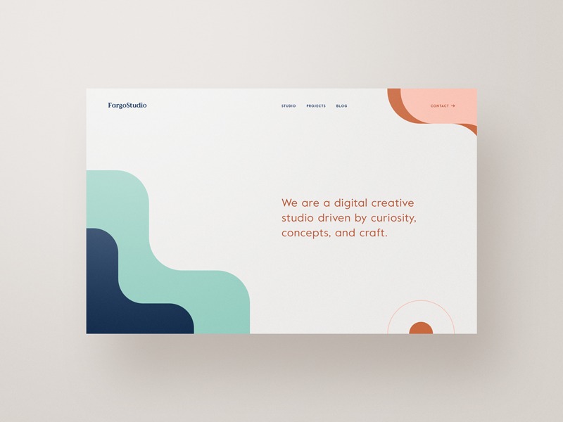
- Negative space becomes a way to emphasize the content and one of the most effective minimalistic design tools.
- Simple color palette – not necessarily light or pastel, but consisting of two or three colors.
- Start with a simple draft. The best strategy is to make a prototype in black and white colors. After this version is ready, decide what colors will suit there.
- Keep heavy elements at the top. Minimalism doesn’t deny photos. Using one for the first scroll will be perfect.
- One concept per page. Devote each page for a new idea. Optimizing the content might be a challenging task, but this is how you make sure the content is not boring.
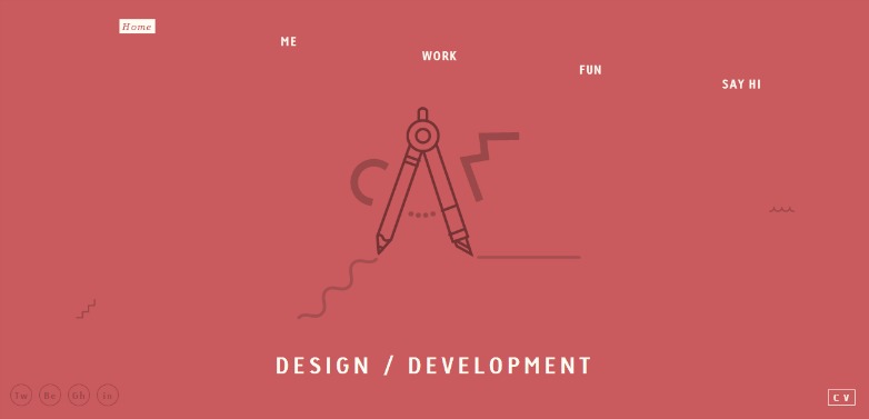
- Extraordinary typography. After you get rid of the excess buttons and other elements, typography will become the center of the visual statement.
Minimalistic web design ideas
Now you know about history and principles of minimalistic web design. How about some examples and trends for 2019?
Flat design
Flat design is the main trend of web design in 2019 – is clear and minimalistic, distinctive by minimum usage of heavy elements. It doesn’t mean that everything needs to be reduced to two dimensions. Instead, you are to deal with clusters and focus on the most important details. Flat design strategies include but are not limited to using bright colors, clear edges, open space, simple imagery. Altogether, these rules help to reduce the time of page loading and meet many SEO requirements.
Massive text
While the expressive high-resolution imagery takes backseat, the text part starts to dominate the screen. Copywriters will be glad to find out that content is on the first place even in product design. The increasing interest to letterforms and fonts helps to attract attention to the information you want to deliver to a user.

Outlines
They are welcome both in imagery and typography. This is a creative means of user interaction that helps to catch users’ attention and create memorable content. People tend to visualize what they cannot see completely. Provide them with an opportunity to create something in their minds. Sans Serif and Helvetica seem to be the prevailing letterforms of the year.
Brutalism
Besides unexpected (often striking) solutions and reconsidering usability, brutalism denies standard abundance of colors, images, buttons, etc. It can be a surreal blend or an extract of the most important elements, precisely tailored together. Be careful: you need only the latter!
Monochrome palette
The majority of minimalistic websites use colors in order to attract users’ attention to important information without using images or other graphic elements. The less visual objects you use, the more significant colors become. Use several shades of one color or one saturated color for emphasizing the chosen elements. Colors should establish informational and emotional connections with the product and to create visual interest.
Big bright images
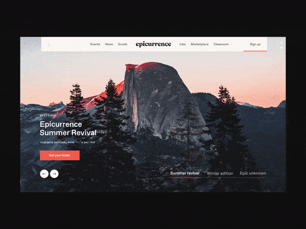
This is an accompanying trend. Some will not agree that such multimedia solutions are appropriate. Use images only when they help to understand the website. The most effective strategy is to occupy the first scroll at full page width. Keep the rest of the page simple as it supposed to be. If you use a single image in the middle, choose something bright and use it to create a composition center.

Modular grid
This is not the most common solution, but designers use it quite often. The grid is appropriate in two cases: you need to arrange the homogeneous content or design an adaptive website.
What about the future?
The design world is very dynamic. Most of the current design trends will be reconsidered until the end of the year and represented by some new forms and principles. So what makes us certain that minimalism is a promising and perspective approach to website building?
The design doesn’t develop in an isolated environment. It depends a lot on web development trends and perspectives. Web development, in its turn, focuses on machine learning and simplifying user experiences.
Take, for example, any artificial intelligence website builder. It takes a couple of hours to create a website on your own, even if you don’t have any knowledge of programming. Developers tend to let services operate automatically whenever possible. This is minimalism in user experience, which comes hand in hand with minimalism in design. People strive to make things simple, that’s what makes the minimalistic design so popular and perspective.