You have an amazing and fool-proof business idea, you have all the resources to turn your applications into a cash cow and yet you are prone to fail. With marketing strategies and promotions, you will be easily drive the users to your mobile application. However, if the design fails to attract the attention of your user, you have a lot to lose. This is the importance of design for building your mobile application. In most cases, the cost of building a mobile app can be low but when you get the final product, you don’t find your investment worth the product.
What should you be doing? Let us guide you in your venture for developing a mobile application. Below are seven most useful mobile app design tips to help you get your business right:
Typography
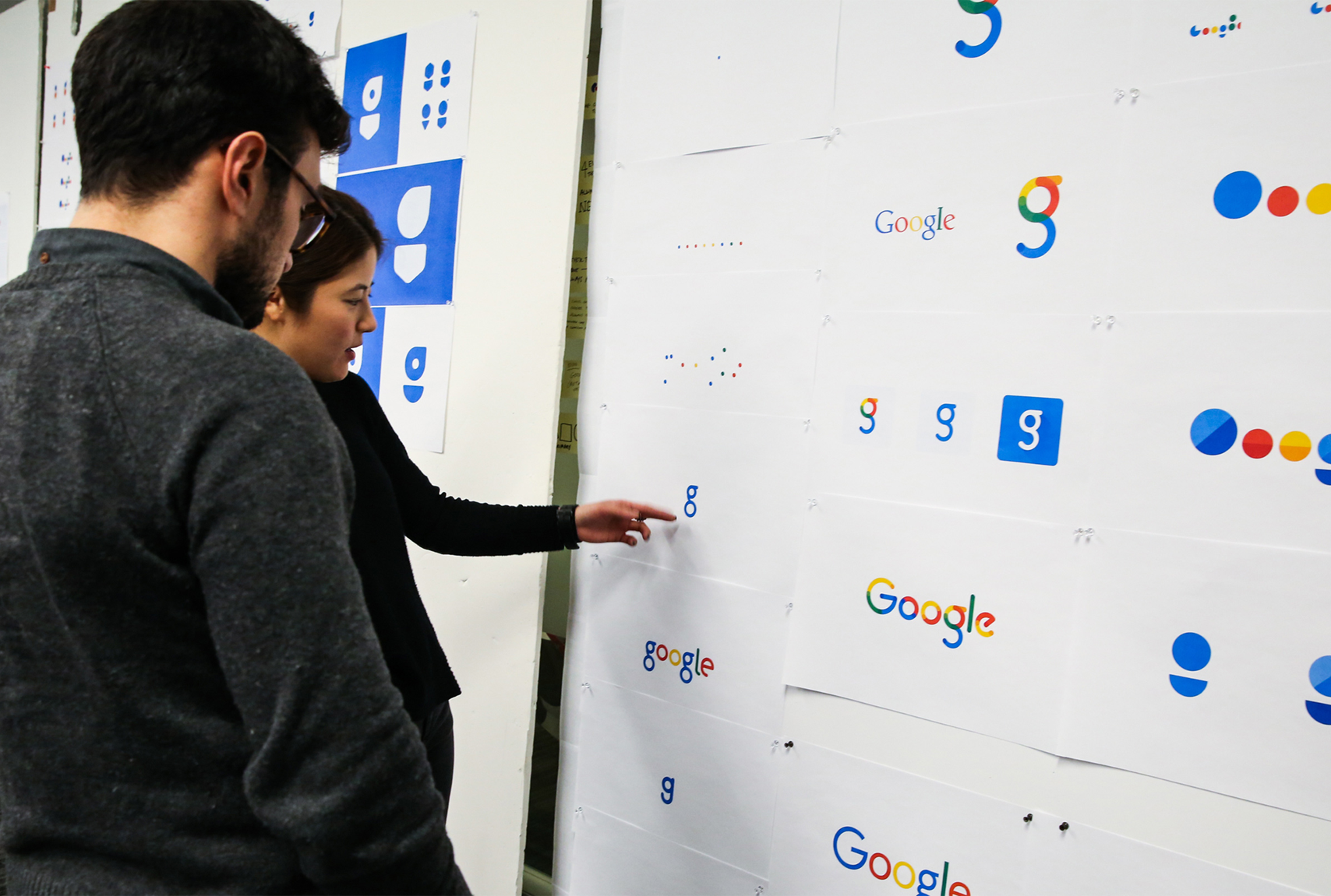
Typography is the first thing that comes into the mind of the user when he first interacts with your mobile application. Try to keep your typography as simple as possible. Use color schemes that compliment with your overall branding. Talking about fonts, they should be chosen thoughtfully. Sans Serif family works the best for the mobile application but again, you can try and decide the font for yourself.
UI Compliance
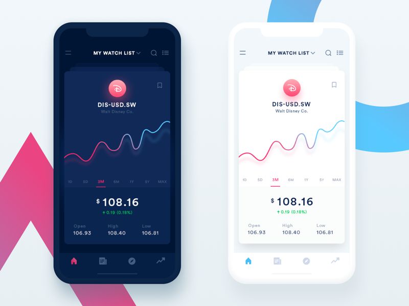
It is very crucial to address the security compliance issues right from the start. This will help you get your mobile app out in the market with a very little turnaround time. UI of the mobile application should be decided by keeping in mind the functionality of the mobile application. If the right data is aggravated by the backend team, the navigation issues can be addressed by the UI designer.
Layers and Depth
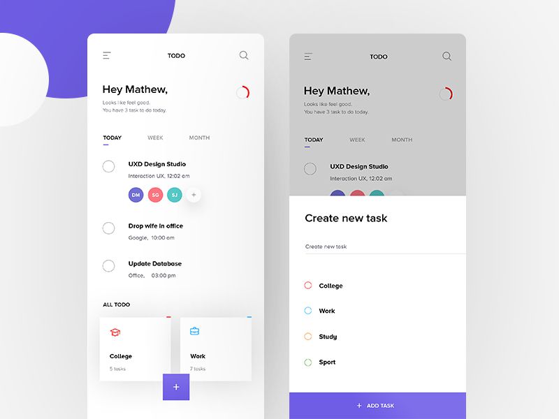
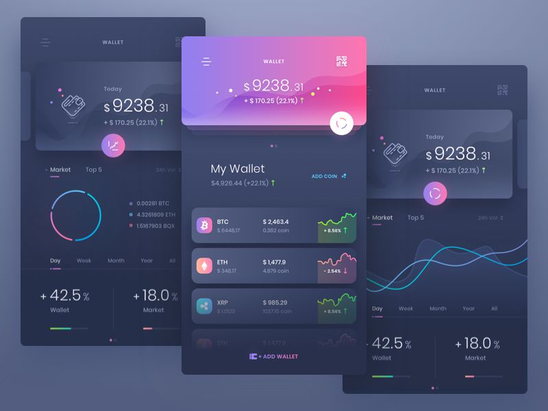
One of the best trends that was followed for building a mobile application is Material Design. We can see the same pattern on Google. The most useful feature of the material design is the layers it creates. The pile of layers with little shadows are used to differentiate elements. These layers are used to hold the interaction tool for the users. It keeps them engaged throughout.
Monotone Color Scheme
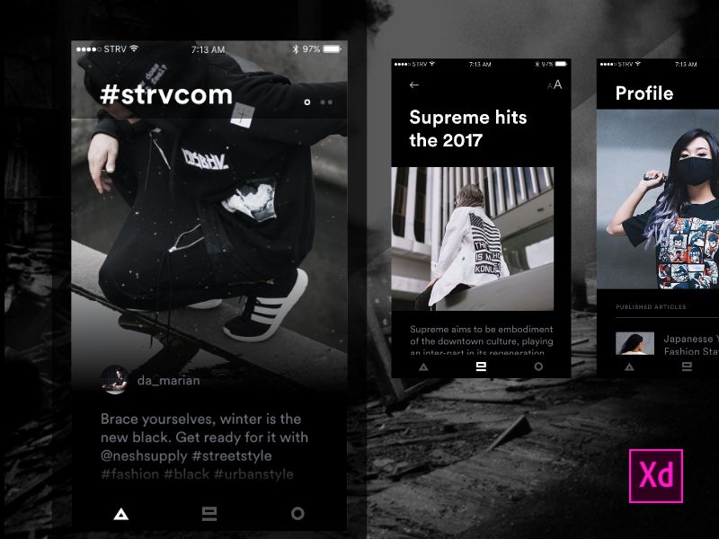
Black and White is the new colorful. A single color with black and white fonts can help you give your mobile application a classy look. Such a color scheme is used to give a visual effect for the mobile screens. However, you should keep in mind that when you choose such single colors, always go for uncommon colors. You can play around with the colors and let the users be a part of this play. This will make your mobile app more engaging.
Micro-interactions
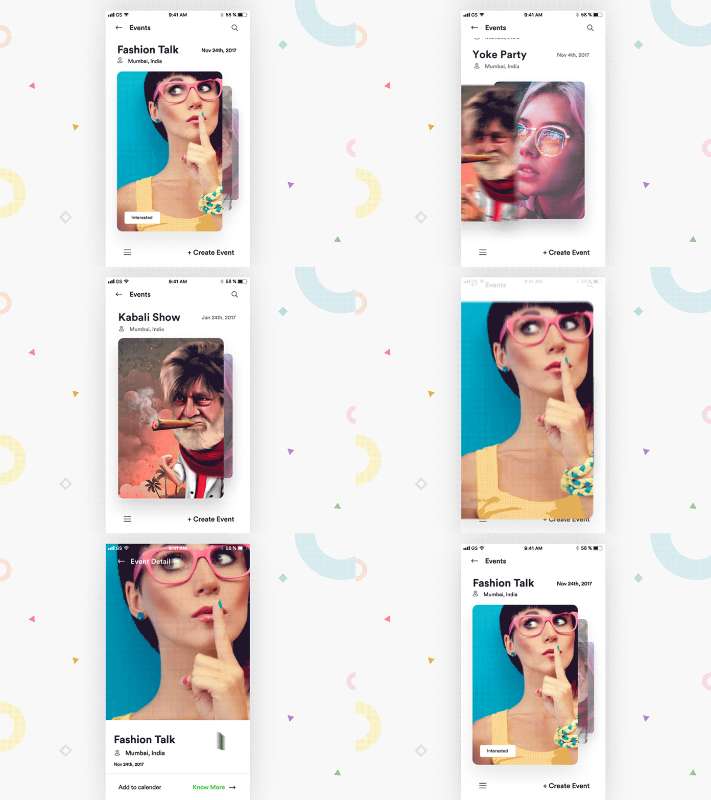
Micro-interactions are the features that are always overlooked but play a very significant role for building a mobile application. These tell the user as to what should be the next step while using the mobile app. In short, they guide the user from one step to another. However, it is important to keep these indications subtle in nature. They should be not have a bright or uninsured color scheme. Rather go for a very pale yet visible color.
Cards
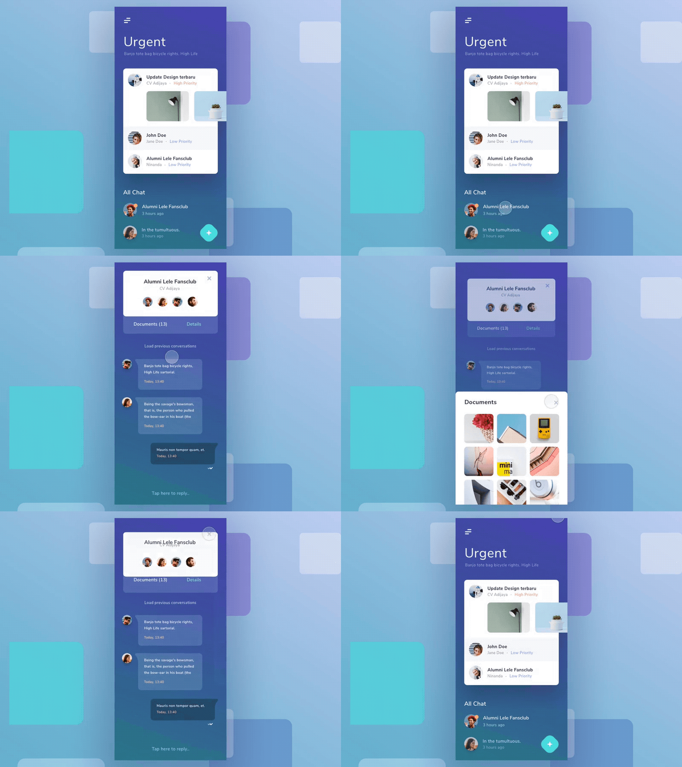
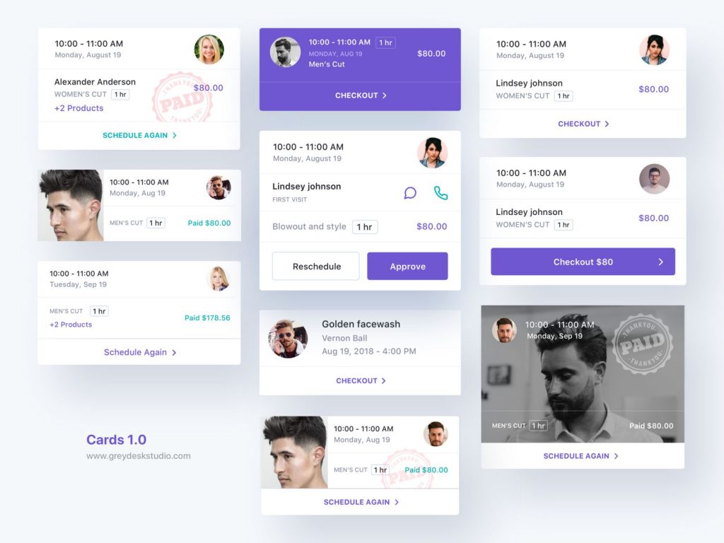
A good amount of traction is seen with the evolution of cards. They are nuggets and are implemented as a part of material design. Cards are such that they help develop and organize the content in a manageable way. The task of each card is specific in nature. While building a mobile app, you should consider adding card for a better navigation. This will help your users get acquainted with the functionality of the app very easily.
Animation
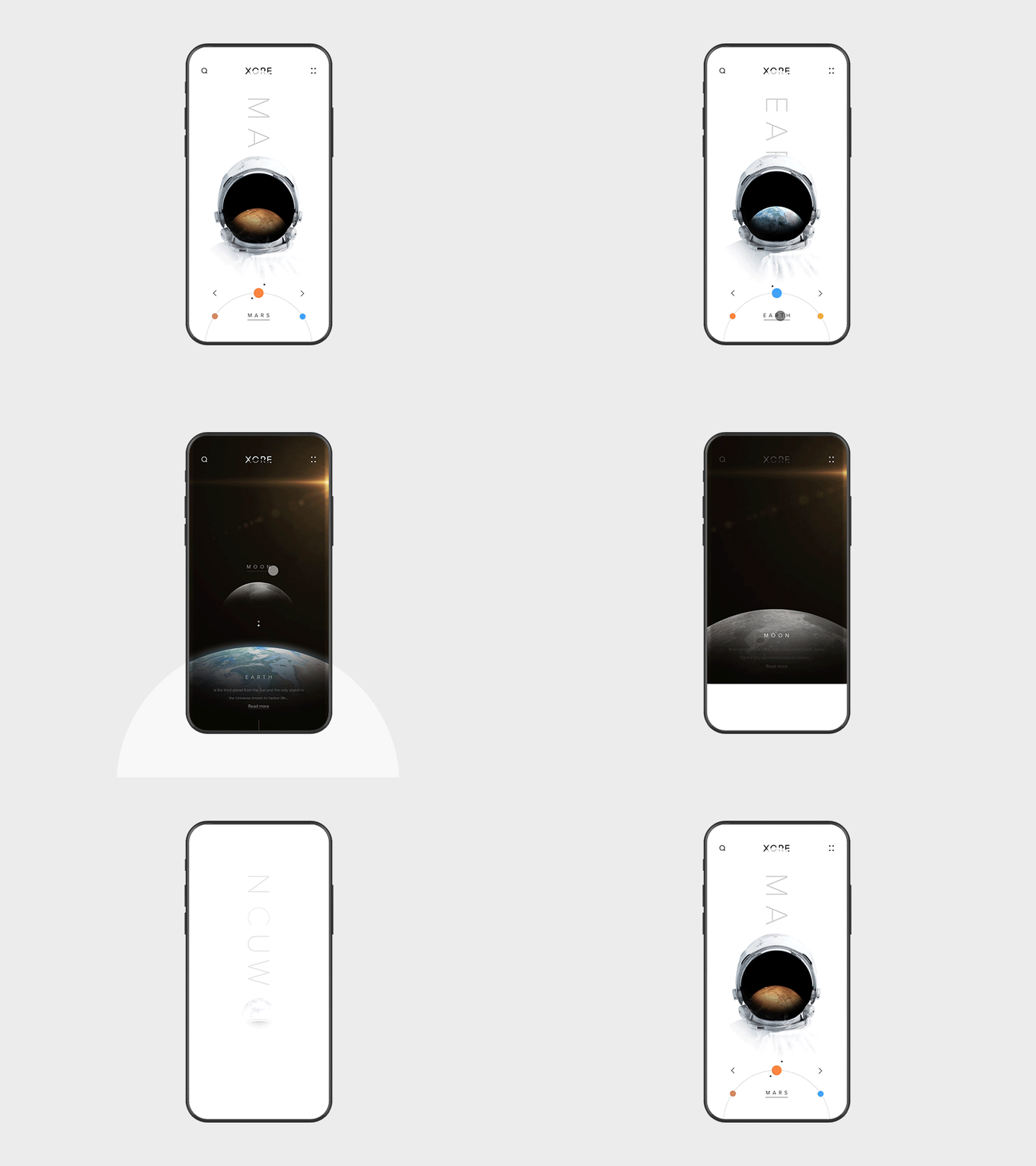
Animations have literally taken over the world. If you are scrolling down your social media feed, you will see an animation in the form of a GIF or a video and it will attract your attention. This is the power of an animation. While developing a mobile app for your business, if you use functionalities in the form of animation, you will be able to grab the attention of your user faster than that of the static functionalities.
Takeaway
These were the 7 amazing design tactics that you can use for building your mobile app. As you see all these design tips navigate towards just one intention – drive more engagement towards the mobile application. Try and make your mobile app as interesting as possible with the help of design schemes.
Designs just don’t have a role in attracting the attention of the users. Design schemes help the user move to the next steps. With effective and appealing designs and content marketing strategy, you can even create a sales funnel and all that is left is – Attract, Delight, Convert and Close. If you feel that these designs may hike the cost of building your mobile app than you are not so right.
The returns that you will earn will be a lot more than a shabbily designed mobile application. What remains to say is, experiment with your designs and convert more customers. All the best!
Author Bio
Shahid Mansuri Co-founded Peerbits, one of the leading Web development company USA, in 2011. His visionary leadership and flamboyant management style have yield fruitful results for the company. He believes in sharing his strong knowledge base with learned concentration on entrepreneurship and business.
