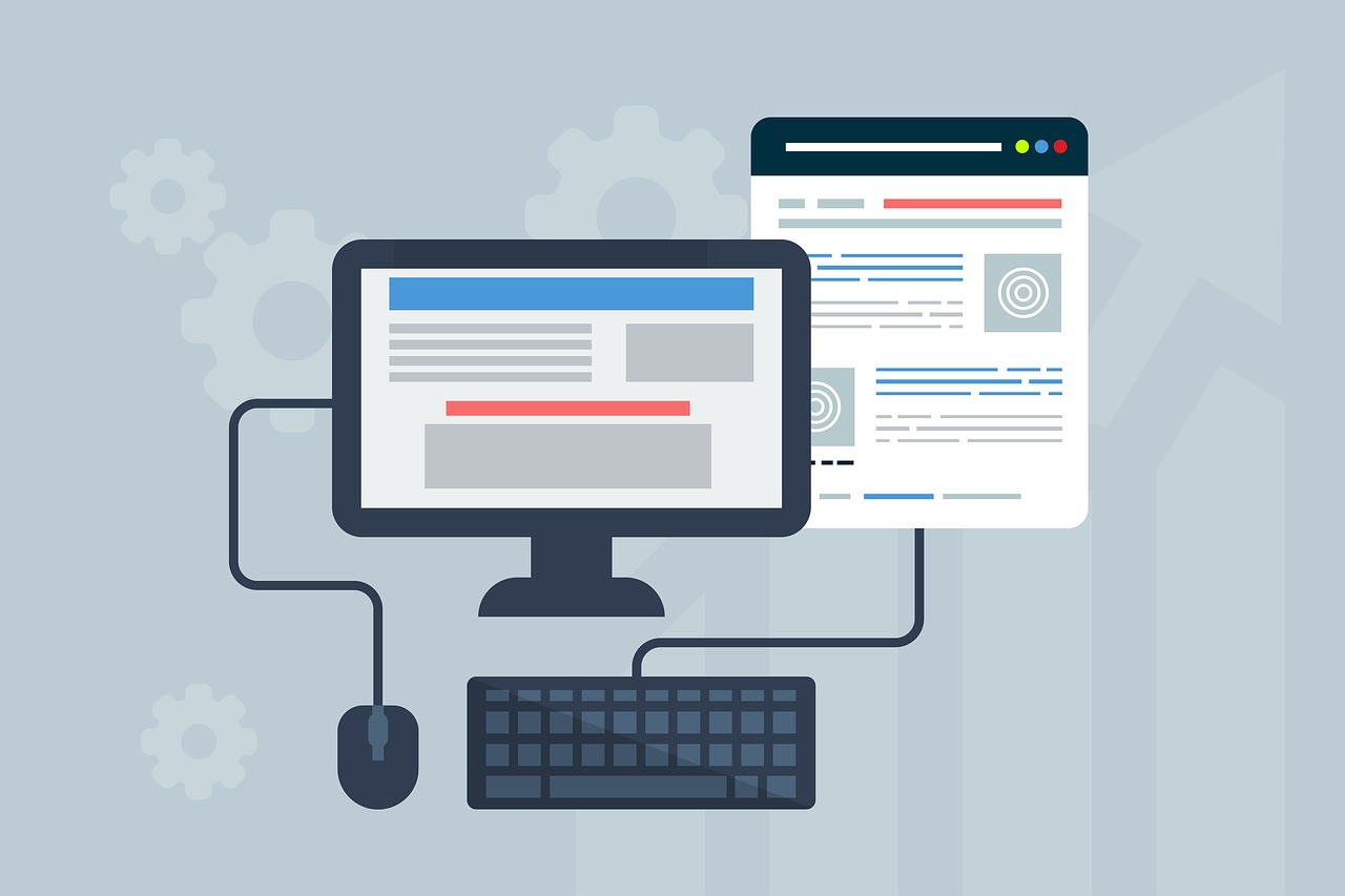
Web design is always a mixture of art and science. On the one hand, you want the site to look good and be visually appealing to the audience. A website also needs to be entertaining at the same time. On the other hand, however, a website must deliver a smooth and positive user experience across the board. This translates to maintaining performance and making sure that every part of the site is effective in delivering content and experience.
In this article, we are going to take a closer look at how online universities tackle these challenges. Online universities like Michigan Tech must make their site appealing enough for students, all while delivering course materials and other learning resources effectively. This is a big challenge to overcome, and there are some UX tips we can borrow from the way online universities tackle this challenge.
Think Usability
Gone are the days of adding visual elements just for the sake of adding visual elements. Every part of the website must have a purpose and serve the audience effectively. When you do add visual elements to improve the appearance of the site, those visual elements must also serve a UI-related function.
More importantly, visual elements must never stand in the way of usability, especially on a learning platform. It is much more important to focus on delivering a usable platform – where learning resources and course materials are easy to access – than to have a platform that looks visually appealing.
Here’s another big secret that top learning platforms rely on: focusing on usability is a fantastic way to find that balance between visual appeal and user experience. Usability can be just as pretty when you start incorporating design elements and styles to the site.
Build a Brand
Browse through the websites of several universities and you will immediately notice that they have different branding elements. Using the previous example of Michigan Tech, you will see a user interface dominated by yellow and black, both of which are the university’s signature colors. Sticking with a color scheme is just the beginning.
Everything about the site, from the fonts you use to the icons incorporated into the design, must present a consistent branding, with consistency being the key here. Consistency makes the brand more relatable and easier to connect with, which is both good for the university as well as the website.
That same branding can also be used to shape the user interface of the online learning platform. Students can stay exposed to the brand of the university. This, in turn, incites pride and a sense of belonging; these are huge impacts that a good user experience can deliver, and they are impacts worth pursuing.
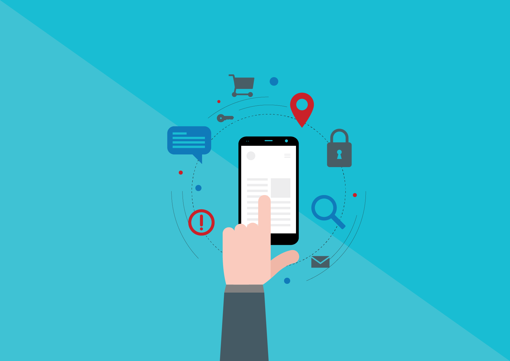
Mobile as a Priority
While mobile-first is often seen as more of a jargon term than a sensible development approach, prioritizing mobile interface over desktop is still a necessary thing to do. Over 70% of internet users now use mobile devices to access web pages and services, including online learning management systems. Students who want to get an online master’s in electrical engineering today are already used to using iPads to access the internet.
Placing mobile as a priority comes with its own benefits. For starters, focusing on performance of the site will not be difficult, since you have mobile performance in mind from the very beginning of the design process. More importantly, the site will scale up in a more sustainable way when mobile UI is a priority.
On top of that, placing mobile as a priority is good for the user interface in general. With more people glued to their mobile devices, even their user behavior when using desktop computers shifts further to a mobile interface. This is exactly why we see hamburger menus and other elements commonly found on mobile sites becoming more prominent on desktop sites as well.
Content First
Universities managing their own learning platforms have another big hurdle to overcome. They need to deliver complex content – learning materials, streamed lectures, and more – in the simplest, most seamless way. This is why learning from online universities and learning platforms is a great thing to do if you are a UX designer.
Rather than using an old-school user interface such as lists and long text, most learning platforms resort to book covers and icons. Descriptions are made shorter and the entire UI is designed to be cleaner. That airy feel you get when accessing a clean user interface makes the whole learning platform more pleasant to use.
Content is still king. Choosing a readable font and designing complex content using simpler layouts are among the things you can do to make sure that your content is delivered successfully to the audience. As an added measure, you can run A/B testing to refine content delivery and make sure your audience – students, in the case of online learning platforms – enjoy the best UX.
Refine!
That last part is another important thing to learn from online universities when it comes to user experience. Never stop evaluating and improving. If you were to review online university websites from a few years ago and compare them to websites of the same universities today, you will see a huge jump in user experience and design in general.
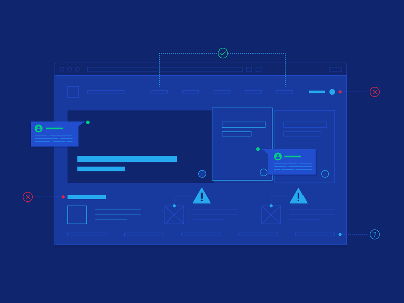
Constant improvement is critical to the delivery of positive user experience. Even better, you can now learn from the users directly, either through surveys and analytics or by asking questions on social media. The insights you can acquire from various sources certainly make improving UX and fine-tuning different parts of your site easier.
Knowing which metrics to track for UX purposes helps too. You can monitor metrics such as time-on-site and bounce rate for a more general look, and then review detailed metrics like heat maps to dig deeper into the many ways you can improve your website’s user experience.
Combined, all of the things we can learn from online universities and the UX of their learning platforms are invaluable. These are strategies you can implement directly and adopt in different ways; these are the strategies that will help you take the user experience of your website to a whole new level.