Creating a trend or following the web design trends for 2018 in creative disciplines is a great way to gain popularity. When it comes to the creativity in the digital world, nothing can be a better option than website designing. Almost every business owner wants to have a website that is unique in its design and functionality. This helps them to provide the best interface to the users and gain attention from them. Once, the websites become popular, the customer conversion rate automatically gets higher. For this, web designers keep on giving the innovative ideas out of their head so that they can design the website that is completely different but attractive. Web designers are continually bringing some innovate solutions for meeting up the technological challenges for their websites.
The trends in web designing that you can master in this year
Web designers should follow some trends which help in designing the website effectively. Here are some of the latest trends in website designing that helps in making the websites attractive:
Super color scheme
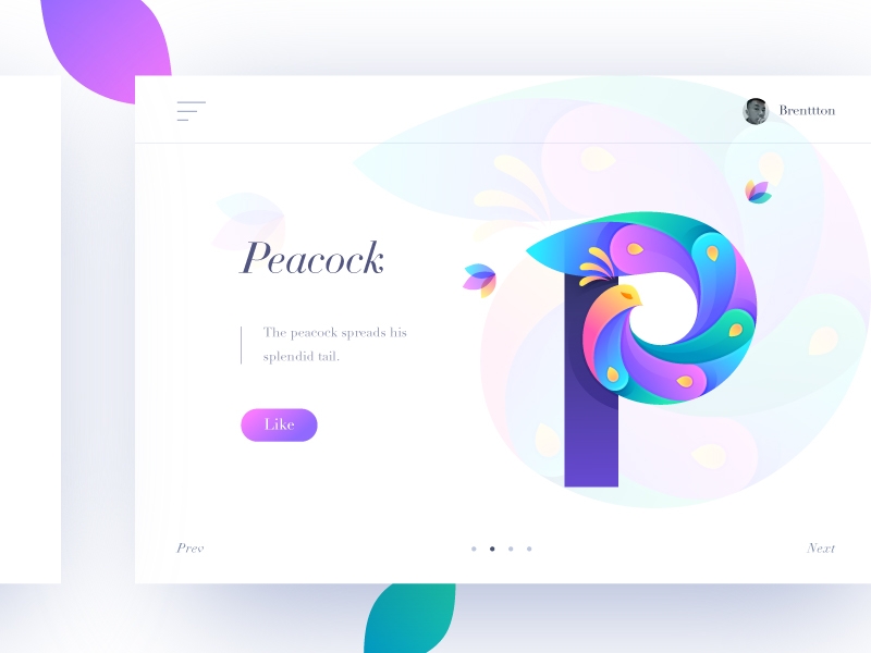
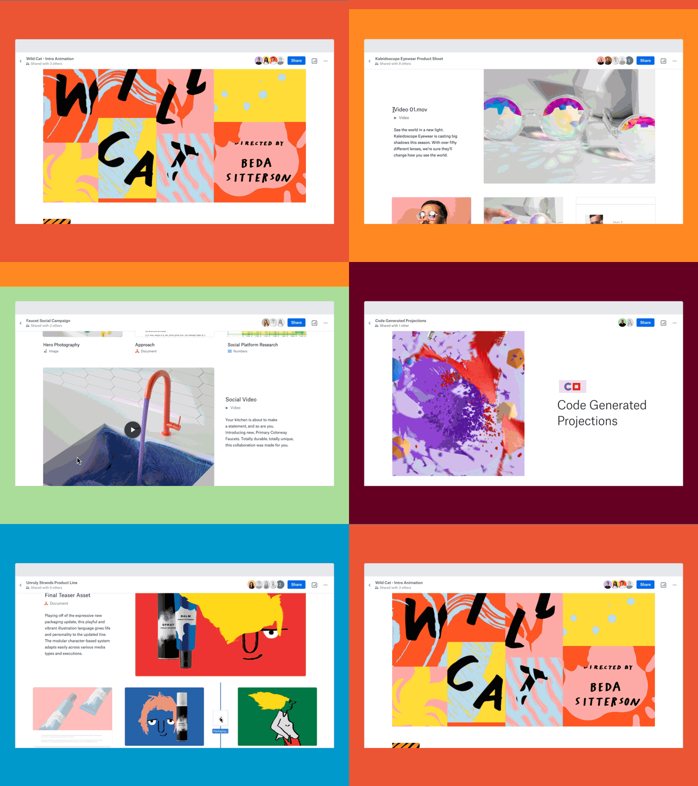
In the past, many web designers and the brands has many restrictions to the web safe colors but 2018 has come up with the super color scheme. Vibrant and super saturation color schemes are in the top list of the web design trends. Stacked layers of the vibrant colors add attractive texture to the simple design of the website. The use of vibrant and clashing colors helps the website to attract the customer’s attention easily. Different types of gradients with vibrant color scheme make the website attractive.
Use of the particle background
Inclusion of the animation or video in the background is another trend that is getting attention. In general, the common video makes the websites heavier and causes problem in performance. But, the use of the particle background eliminates this type of issue. The particle background does not create the loading issues in the website and the motion graphics create the eye – popping effect on the website.
Designing the mobile friendly sites
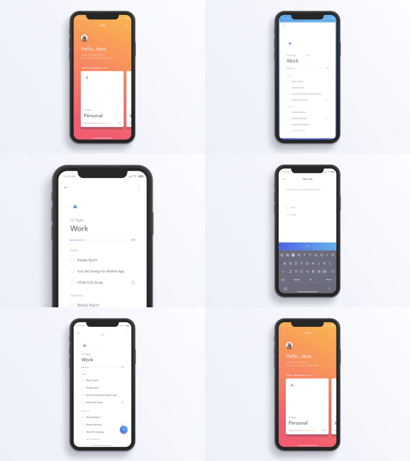
Earlier, people only has less knowledge on mobile browsing. In 2018, everyone is mobile friendly. From students to the retired people everyone access web browsing on their Smartphone. Hence, creating the mobile design of the website has become a trend. Mobile designs allow the users to view the website in the best layout that fits on the mobile window screen.
Bold typography
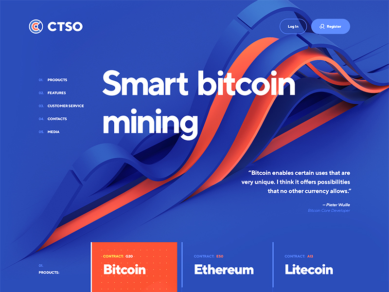
A lot of people are there who want to create a high impact on their online visitors through the bold text on the landing page. Hence, many of the web designers are now using the bold text of the heading on the home page. This looks more attractive when the rest of the page is clear or has minimal text. All the detailing on such websites is done on the other pages. The bold and big looks of the typography make the website more comprehensive and attractive.
Use of the photographic content
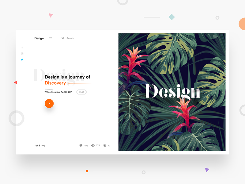
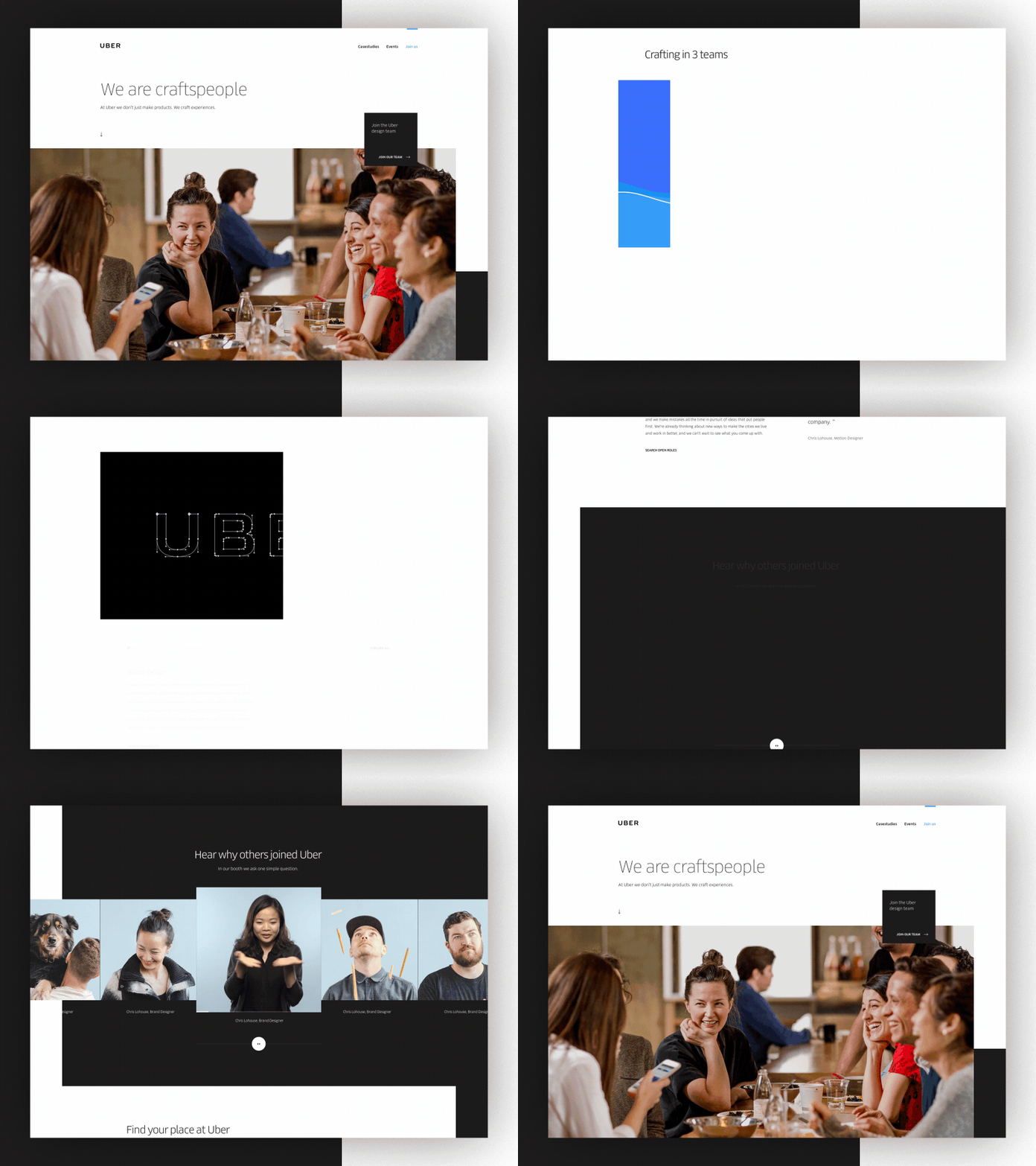
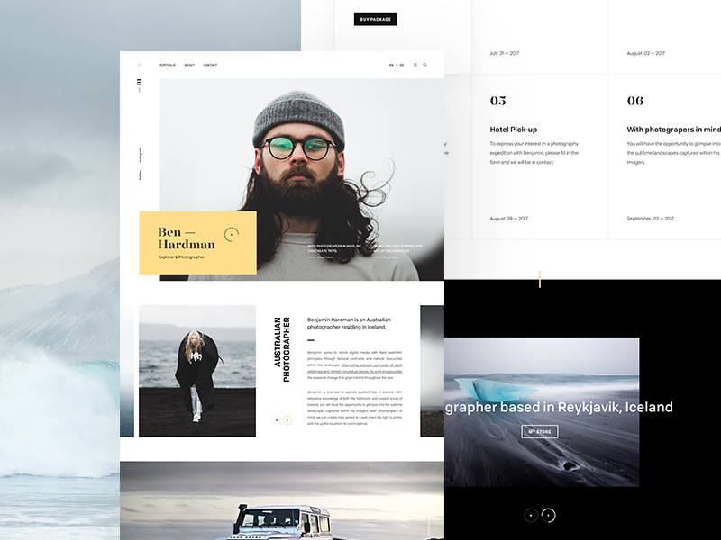
Images and content are the two main things that make the website informative. Adding the images and the content separately is less appealing and space consuming also. In 2018, the web designers are providing the photographic content on the websites. This means that content on the website has the related image in the background. The overlapping texts convey the message with visual appeal.
Web – brutalism
It is the web design trend that is considered as the digital art. It provokes creativity rather than following the standard web design pattern. Eclectic and convention – defying structures are chosen by the web designers. It includes asymmetrical, stark, lack of hierarchy in layout and non-conformist visuals. Asymmetry in the layout makes the website bold and attractive.
Use of the powerful illustrations
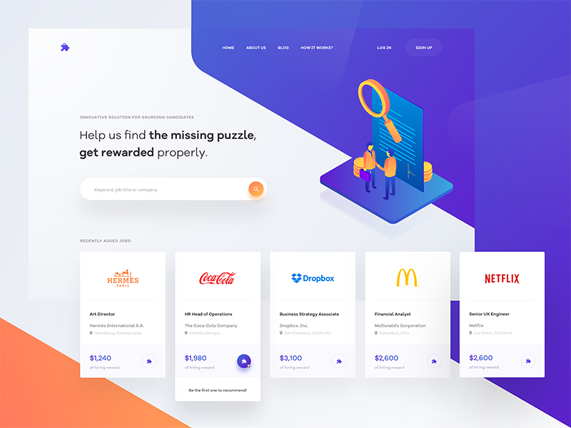
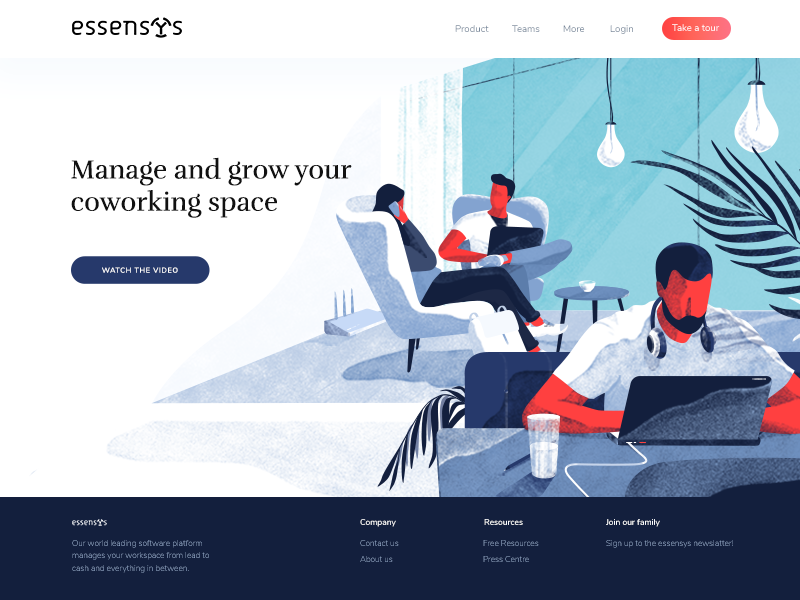
Users do not want to waste their time in reading the content on each and every website and then choose the website which meets their need. They want to be precise in choosing the websites. Therefore, now web designers use the powerful illustrations in the website designs to make the users easily understand the message. Outstanding illustrations make the websites visually engaging and inject the personality into your simple looking website.
Inclusion of the grid layout
Another big change that web designers have brought in 2018 web designing trend is the use of grid layout. This type of layout creates the distinctive and unique looks. Lots of brands are using this type of layout for making their website more attractive.
Addition of the unique and organic shapes
To make the website unique and distinct, the use of organic and oblique shapes is the latest trend in 2018. Aggressively rounded corners, double-down on straight lines, spherical and rectangular shapes and many other organic shapes are now used by the web designers in their website. Along with the use of these types of shapes, the flashing colors from the edges of these shapes create a distinctive look of your website.
Sticky navigation tools
In 2018, web designers are creating the websites completely friendly for the users. They are providing the websites with the fixed navigation tools bar so that they can follow the users as they scroll down the web page. This type of feature keeps the users and the customers on the website to easily access the navigation tool.
In addition to these web design trends in 2018, there are many more web designing trends which are used by the web designers. They keep on providing the innovative ideas which are helpful in making the websites interactive and attractive.
About the author
Vinod Kardam is an entrepreneur and a tech guide. He has work closely with the leading companies like savemypocket as a client to provide them the best IT solutions. He believes in keeping a match with the technological advancements. Also provides guidance to the young IT experts for following the latest and ongoing trends in the web development and other IT solutions.

