Such has been the evolution of the digital business world that almost all kind of offline businesses have extended their presence to the online world. For a business to excel in such a diverse and competitive environment, it must cater to the client’s needs and demands.
Users tend to expect only the very best and choose to stay with your brand only if they receive something extra. This strategy is now employed in almost every industry in the business. Hence, understanding your clients and delivering what they need should be your strategic online business priority.
If you are running an online store, your business website will have to finally develop and embrace the best designs which help you deliver precise and well-organized info to your clients; something that is likely to help them stay by providing a great User-Experience. Here we describe how the UX strategy on your website will help cater to your business needs and enhance it as per the customer preference.
1. Increased Conversions

You need to understand that a great UX design on your website will ensure that your online site audience gets to experience the best. A great navigational UX design will keep the audience pleased, keep the existing customers coming back, and obviously, drive in higher conversion rates.
Once you are able to capture the attention of your clients, you need to keep them bound. You can only do this if you have a great UX design that takes the audience seamlessly through the entire website. Once your design finds a way into the audience’s heart, more traffic will drop by.
75% of users judge the authenticity of a site simply by looking at its layout. Hence, using a better UX design always boosts your E-commerce website:
- A great product catalogue for enabling a clear product view from all angles.
- Enabling a faster product selection and checkout process to save the buyer’s time.
- Categorising the products in well-sorted categories that will probably be the search keyword for buyers.
- Minimal design to let users see the most of what they want to see.
- Setting up a blog for your business can also fuel conversions as people look at them for gaining insights into the business and its functioning. The layout of this blog should be such that it offers subtopics for various subjects that are relevant to the business.
2. A faster loading E-commerce website
If you choose to incorporate a steady and effective UX design into your online website, you will be able to drive away the customer’s pre-planned frustration that comes with a preconceived idea that online stores are all glamour and not substance.
The truth is that a lot of inexperienced online shopping website owners do not pay attention if their websites are slow and hence they manage to kill the User Experience for their potential customers. If you invest in a UX design that is focused to fasten your site’s speed, your website will be fast to load, lowering the site’s abandonment ratio.
3. Mobile audience reach

Look around! Most of the people you see are busy twiddling on their phones. When technology has brought access to your fingertips, you will surely use it at your convenience.
Most people tend to shop online with their phones. They choose to do so in the small breaks they get, on the subway or while simply laying on the couch.
A study talked about how 80% of shoppers use a mobile phone even when they are shopping in a brick and mortar store, either looking up for comparative pricing, product reviews etc. Hence, smartphone devices form a larger part of the shopping process of an average person’s life who has access to the services. Mobile phone usage accounts for as much as 67% of the purchases.
88% of users won’t revisit a site if they had a bad experience. The statistic signifies how important it is to have a mobile friendly web design with a presentable outlook. When clients judge your services based on what they see, you need to pitch the perfect look for them in order to gain their trust. You can do this by solidifying your UX design.
4. Capturing high-on-life class of customers
A large set of your potential customers might have limited time at their hands. They are not going to read an pages upon pages of your services. Instead, they look to get the important bits. Now, it is your task to implement a minimalistic UX design that is able to capture such clients in the first go. You can improve and optimize your page by:
- Including product highlights to draw attention to featured products
- Organizing the product catalogue for a gender based selection
- Incorporating images for product tutorials
- Targeted suggestions
These are just some of the many ways you can optimize your content for your clients. After all, if they are looking for a select few features to make their decision, why not show them yourself?
5. Seamless and hassle-free shopping experience
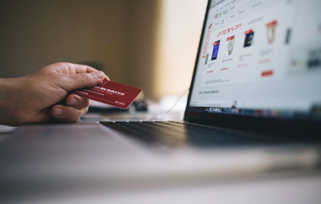
The human mind tends to find the easiest way out of a solution. Naturally, your clients are looking for a product that they can find as soon as possible. Now if they can’t find it, they will definitely switch to another site which has a better search feature. This is why you need to improve your UX design in order to deliver better search features among other things. This will ensure your clients stick to your site and become loyal customers. For this to work, you need to focus on some major things which include:
- Loading time, which is the fraction of a second wait before your site loads
- Search features to access different products
- Information, about the different product to boost sales
- Reviews which will help promote a sense of safety among clients leading to higher sales.
- Convenient check out, without excessive trouble or steps that will ensure that the customers proceed with the purchase.
6. First Impressions Matter
Remember that colors are good, but using too many colors may interfere with the layout and overwhelm the customer. Using extra loud and vibrant colors all over the layout can disrupt the actual message. Clients can be easily damped by the brightness and can pull out simply because they think the website is ‘too childish’.
You need to embrace a themed approach. Stick to the two colors UX design, at most. Try to portray your message in a well-planned and well-executed manner. This will help you stay on track and will also please your customers.
You know that first impressions matter; well for a website, the first impression is everything. From the layout to the theme, to the features and the customer support, everything plays a vital role in forming the ultimate package for the customer. You need to think out of the box to please your audience and having a well-established website is one of the major keys. Doing this will help your website and business by:
- Appearing to be more professional, delivering a formal, presentable view of your business
- Appeal to clients, attracting their vision
- Attain their approval, a good website with the right colors and the layout is more likely to gain approval than otherwise.
7. Visual aids are the guidelines to success

Incorporating Breadcrumbs which are navigational bar indicators will help your website shoppers figure out the the number of steps left before they actually check out. This is one of the major tactics employed by e-commerce sites and is a major success. Not only does it give your site a professional look, it also helps assure the client that they are almost done.
Final words
There is no denying the fact that the UX design plays a critical role in the E-commerce industry. In fact, a good E-commerce website starts with a good UX design. You cannot strive for long on the competitive internet platform if you don’t have the desired features to stand apart. This is why you need to consider the valuable advantages mentioned above and optimize your online shopping website’s UX design to boost your business productivity.
Author
Catherrine Garcia is an experienced Web Developer and a passionate blogger. She loves to share her knowledge through her articles on web development and WordPress.
