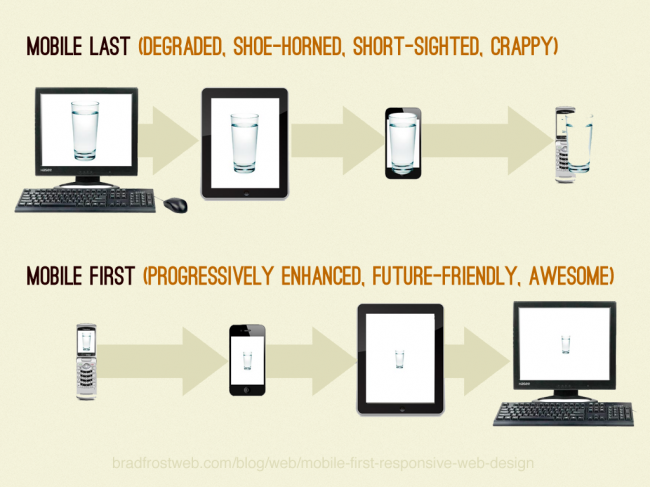
You already know what Responsive design is, you have also done lot of websites with Responsive design. You are very happy by using latest technologies. However, do you ever heard about Mobile first responsive design? You may heard that The HTML frameworks like Foundation and Bootstrap 3 is Mobile first. Did you understand what Mobile first responsive design is? We will discuss about mobile first responsive design today.
What is Mobile First Responsive Design?
In simple words, Mobile First Responsive Design is a way of designing websites for Smaller Screens, and then progressively adjusts your design for devices with larger screens using CSS Media Queries. Luke Wroblewski first introduced the term “Mobile first” to the Web World in 2009.
More often than not, the mobile experience for a Web application or site is designed and built after the PC version is complete.
Here are three reasons Luke mentions about why Web applications should be designed for mobile first.
- Mobile is exploding
- Mobile forces you to focus
- Mobile extends your capabilities
Responsive web design vs. Mobile First Responsive web design
Responsive web design(RWD) is an approach to identify the Client device and changing the layout to fits the screen with Media Queries. In RWD, first we will design for Larger screen and Change the layout for smaller screens.
Mobile First Responsive design (Mobile First RWD) is just opposite to Responsive design. In this method, we will design for Smaller screen first, then change the layout with CSS media Queries when the screen Expands.
In Simple Words,
RWD is – Desktop -> Tablet -> Mobile
Mobile First RWD is – Mobile -> Tablet -> Desktop
Benefits of Mobile First RWD
Brad Frost describes the following benefits for Mobile first RWD
- Allows websites to reach more people (77% of the world’s population has a mobile device, 85% of phones sold in 2011 equipped with browser)
- Forces designers to focus on core content and functionality (What do you do when you lose 80% of your screen real estate?)
- Lets designers innovate and take advantage of new technologies (geolocation, touch events and more)
How to create a Mobile first responsive design
The Challenge
According to Jason Grisby, Mobile First RWD approach requires addressing some of the following challenges:
- The need to start over and design for the smaller, more limited devices
- Ability to replace images with higher resolution images as the size or dpi of the screen increases
- Ability to test for screen size and capabilities
- Ability to add more javascript as capabilities and/or screen real estate increases
- Ability to add more markup as capabilities and/or screen real estate increases
- Ability to modify the layout as screen real estate increases
- Decision about how to handle doctype and other markup if you’re going to support older phones that primarily support XHTML-MP
Here is an overview of how to create Mobile first responsive design written by Brad Frost
How to know if a website is mobile-first or not
When this question is raised in my mind, I asked the question in UX.stackexchange.com. I got an answer from JohnGB like
In terms of recognising a mobile first design, there is no clear way. It is just a methodology for designing that many people find helpful.
Then, I found Jason Grisby’s Article describing “How do you know if something was designed mobile first?”
He believes that mobile first RWD sites will exhibit common behavior as either a direct output of or a byproduct of their mobile first focus:
- The total size of the markup and assets for mobile web will be significantly smaller than that delivered to desktop web.
- The total number of http requests for mobile web will be smaller than those delivered to desktop web.
Examples of Mobile First Responsive design
There isn’t a lot of sites created with mobile first responsive design, For your inspiration here are some frameworks and Websites that built by Mobile-First Approach
Frameworks
The latest version of foundation (v4.0), by Zurb is now Mobile first.
Bootstrap, The popular HTML framework built at twitter, is releasing their new Bootstrap 3, is Mobile first.
Websites
Jason Grisby reviewed every sites in Mediaqueri.es gallery and found these sites that may be Mobile First RWD
Wrapping up
Mobile first Responsive Design is still young and we will expect more websites, articles and tutorials in 2013. 2012 was the year of Responsive design, and 2013 may be the year for Mobile first responsive design. We will hope for the Best. What do you think? Please let us know in comments.
Image Credits : Brad Frost & Zurb
Further Reading
http://www.abookapart.com/products/mobile-first by Luke Wroblewski
http://www.lukew.com/ff/entry.asp?933 by Luke Wroblewski
http://www.uie.com/articles/mobile_first_rwd/ by Jason Grisby
http://bradfrostweb.com/blog/web/mobile-first-responsive-web-design/ by Brad Frost
http://www.html5rocks.com/en/mobile/responsivedesign/ Brad Frost on html5rocks
http://en.wikipedia.org/wiki/Progressive_enhancement Wiki about Progressive enhancement


