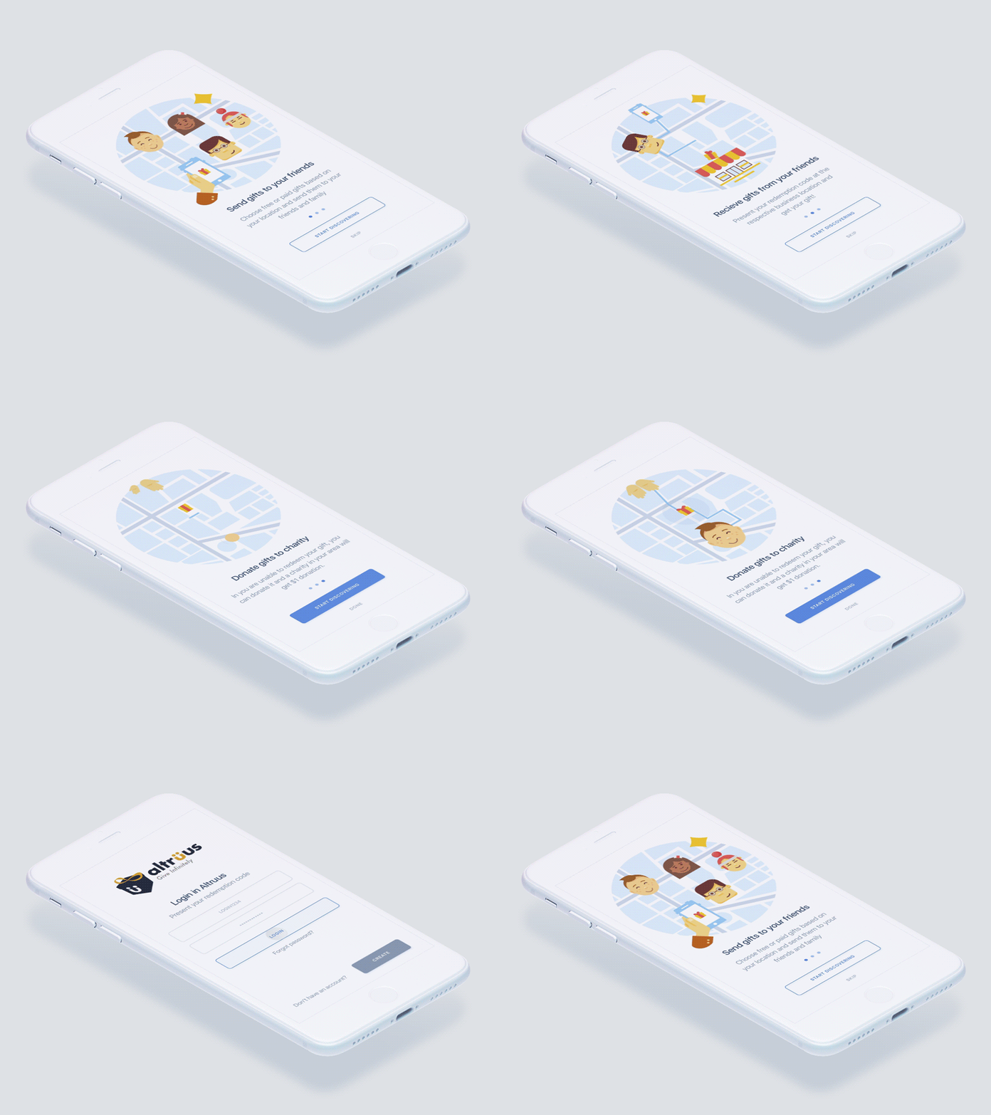
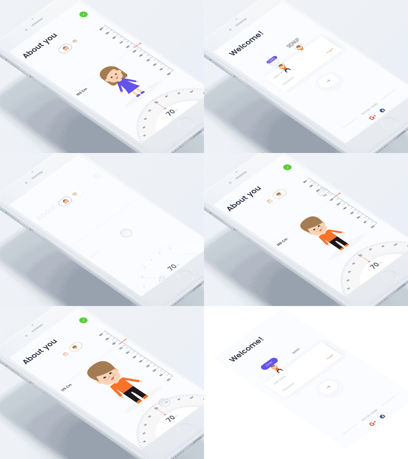
These days web and mobile app development is more focused on creating unmatched user experience than ever before. The experience of a digital product whether it is a website or a mobile app depends more on design. Among the many things that can add to the delight of a design, the animation is a crucial one. From a design perspective, a delightful experience is all about the ease of use, pleasurable performance, and aesthetic charm. How can you use animation to delight your users in the befitting way? Well, before we shed light on that question let us understand when to use animation to achieve delight in design.
When to use animation to achieve delight in design?
More than any other aspects, animation add ease and fluidity to the flow of the user interactions. It easily takes the user from one page to the other with the simple and effective flow without causing any distraction. There are basically two ways animation can add delights to the design and in turn add value to the user experience. First of all, the animation just works superbly to create a good first impression making the digital products more memorable and shareable. Secondly, animation helps to connect audience emotionally and help to make the experience a happy one. Here are some of the ways animation helps creating a delightful experience.
1. Hold users attention during loading time

Loading time is always a crucial element to determine the technical excellence of your digital experience as a whole. In spite of doing your best to optimize the speed and performance of your websites, you always cannot ensure optimum speed, especially if it remains to be a data-heavy website. Such a situation remains unavoidable for the most part. In order to prevent user experience suffer from this, you can keep your users entertained with animation effects. For the entire span of loading time that the user needs to wait, just a loading bar is not sufficient enough. A beautiful and creative animation that holds the user’s attention for the entire span of time, can prove valuable for the overall user experience. Such animated effects that make the best of the loading time actually keeps users happy rather than loading time with a blank page or a boring loading bar that keeps filling up.
2. Educating users and onboarding experience

Onboarding these days is a vital component of the digital experience. As the users are fast losing their attention span, a quick address to what they are looking for and quickly introducing them to the features and on-page elements are important. For designers to ensure this onboarding experience, educating users in a simple and engaging manner remains to be the priority. Quicker the users understand the useful elements of the app or website, better they engage with the app or website. When it comes to business conversion, animation adds huge value to an interface. For instance, when depending upon the customer choices in a store, the suggested products grabs attention through an animated movement or when the forms are filled with animated effect based on user input, such Things adds to the delights and helps to convert business.
3. Use feedback to show what’s been accomplished

Another impressive way animation can really add value to the user experience is through feedback. Animation can be used as visual feedback to give hints of a website performance or the working of a particular feature. Just like the animation used during loading time this gives users a clear idea of how the site or app is working and what the users should expect. In a way, it sets an expectation of the users and dispels the uncertainty. Most importantly they can hold the attention with interesting moving objects on the screen. The other way animation does an impressive job is by grabbing attention to the buttons and business critical elements like shopping carts. An animated movement with the elements can prove to be more attention grabbing and quickly engaging than many other elements. Animation can also be used creatively to give a warning to the users on certain actions.
4. Helping to avoid or mending errors

Errors are human and so they are for the users on digital platforms. Even after being completely aware of how the app works, users just forget and commit the same mistakes again and again. On the other hand, an app suddenly can just stop to respond and again come back to normal performance. Though these things are normal, they incredibly take a negative toll on the overall user experience. No, you cannot do away with errors completely, and that is an inhuman thing to ask. But in the case of such unexpected errors, an interesting animation can give the feedback and can guide us what to do. This is one of the ways animation can take away the negative impact of errors in user experience.
5. Emotional design underlies animation

There have been loads of talks on the merit of emotional design and how it really transforms our user experience as a whole. Now, emotional design basically works on the three plain, respectively as visceral, behavioral, and the reflective. The first one is more about instant or quick reaction of the senses. The second one, the behavioral level is more about the user engagement and interaction. The reflective level is all about the impression that clings to the mind of the user after using the respective products or services. A good emotional design basically works on all these three different levels.
To Wrap
So, here we are at the end of our post and still thinking how really the visual effects of animation can have an overwhelming impact on the web and mobile users. In this respect, we must note that the web and mobile experience these days are largely shared by an array of tools and among them, there are too many that can easily integrate animation into an app UI. A whole array of technologies like JavaScript, HTML 5, etc. has come with their inbuilt graphics and animation capabilities making such integration even easier.
Author Bio:
Roma Kapadiya SEO Consultant & Blogger at Nimblechapps, one of the leading mobile app development companies in India, USA & UK that holds the best team of skilled and expert app developers. I love to write on new and upcoming technology, startups, programming tools, and business and web design. When I am not writing, I read, so I can write more..


