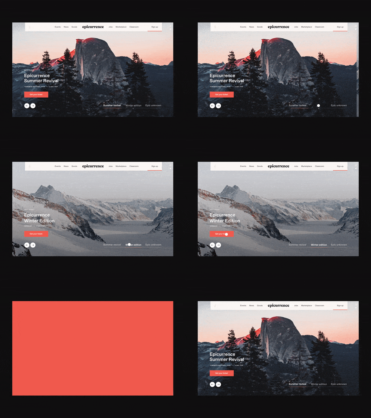
Today animations has become a must-have when it comes to designing a good user experience. Unfortunately, animation is often regarded as a mere decoration or a nice-to-have-added bit of delight in user interface (UI) design but do you think it’s enough? Probably not! The following post emphasizes on how animation adds meaning to User Experience (UX).
Website owners often make a mistake by treating UX as a last- minute consideration. On the contrary, it is something that has to be taken into account right from the very beginning. However, whatever your level of expertise is, in the post, you are bound to find something precious, some kind of clue that will certainly help you in understanding and improve your technique from a birds’ eye point of view.
Why is good animation important?
When it comes to great UX design, animation works wonder like never before! In addition, I personally think it can add a layer of delight and fun. Provide reassurance and meaning to interactions; good animation definitely acts as mini-onboarding. Imagine a situation when you do something and an animation implying the expected result happens but all of a sudden you delete an item, and it fades away or slides off the screen. First of all, it is very important to understand that apart from unlocking the actual meaning in our designs, animation has the potential to provide new models for interaction.
Creating the best UI animations is like coming up with something that has both purpose and style. I mean it has to be purposefully placed in the interface keeping a user-centered reason in mind. Down below I would like you to get acquainted with some of the interesting ways blending animation into UX. Of course, they aren’t the only ones you will find plenty of others, but these are the most impactful one- you can count on me for that!
#1 Attention seeking
Animation acts as a great tool when you wish to direct the attention of the end user. I am sure you will agree with me on when something moves, it becomes extremely hard not to focus on that movement. I mean if there is a still image, I bet you would even bother to go to a see what it is all about but by incorporating animation in the ad banner chances of their drawing your attention increases. On and all, animation in user experience is a winning combination. Also, the power of motion to help users avoid things like change blindness or otherwise being distracted from the task at hand.
#2 Use loading sequences
According to several studies, 40% of users expect a webpage to load in 2 seconds or less. If it takes any longer, they start getting frustrated and leave the site. This inevitably means minimum loading time is very crucial for a website. So what to do? For example, CodePen save button animation- It reminds you with a shaking-pulsing save button animation or “ringing” animation next to a message. It helps in counting number when you have messages.
#3 Using for feedback
Designing good feedback in interfaces is as important as designing an appropriate website. If you wish to convey feedback in both simple and complex flows like almost all website owners, look forward these days. Animation turns out to be a very effective way. Let me show you how.
- Error Shakes – Using error animation for stripe checkout is one of the most effective ways to take into consideration. Being a physical gesture, it helps in conveying that something has gone wrong.
- Material Docs – Another interesting way is to guide or reassure users over more complex flows, like reorganizing Google Docs files. For example, when you are organizing documents, you will find multiple instances of animated feedback guiding you through the process and reinforce that you’re progressing through the actions as intended.
When it comes to animation endeavors with UX
- Make sure it’s not an afterthought
- It must serve a purpose
- Provide content, orientation and of course feedback instantly
- Storytelling can be an added benefit
- Does your animation reflects your brand
Last but certainly not the least, it’s all about providing a seamless experience, and if used correctly animation can work wonders for you. Did I mention that it’s not going to be an easy journey though, but consistency will take you places sooner or later. Time to show how animation is becoming an intrinsic part of a good user experience. So where are you going to have to catch up with the herd? Trust me on this, the sooner you do it, the better. I am sure you will thank me when you will reap the benefits. So that’s all for now! Keep watching the space to get a better perspective regarding the same.
Author Bio
Olivia Diaz is working at eTatvaSoft.com, an Enterprise level Mobile & Web application Development Company. Being a tech geek, she keeps a close watch over the industry focusing on the latest technology news and gadgets.


