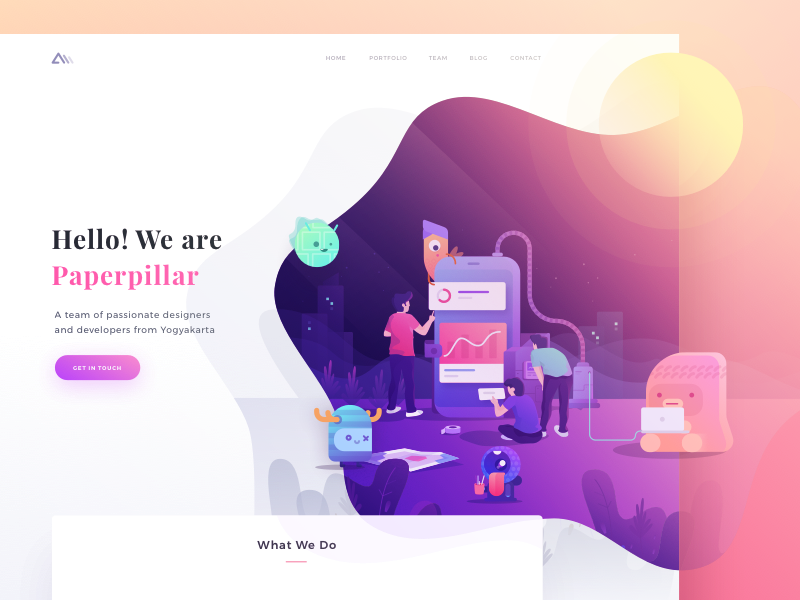
Landing pages have a variety of benefits and are often a staple of any marketing strategy. Be it the promoting of services and products or use as lead magnets, your email list and sales can both benefit from a quality landing page.
Great landing page design is crucial when looking to boost conversions and there are numerous online templates that can assist you. Premade templates are especially great if you don’t know how to code and are easily customizable.
If you decide to go this route and are looking to build a high converting landing page, the following ten tips should help!
Tip 1: Include the Key Elements
Every quality landing page should include the following:
- An enticing headline and subheading
- High-quality pictures
- Engaging and compelling copy
- A clear explanation of any benefits
- A strong call-to-action (CTA)
The idea behind your landing page is the solving of a problem, addressing particular pain points your customer may have.
Tip 2: Choose the Right Pictures
Images help to convey your message effectively and are a great way to break up chunks of text. Poor quality images, however, can hinder more than help. You’ll want to ensure pictures are of a decent size and relevant to the products or services on the landing page.
Tip 3: Make your Copy Compelling
Your landing page copy exists to explain your offer, product or service. It would be best if you told the user why it solves whatever problem they may have by communicating your unique value proposition.
There should be clarity, avoiding jargon or puns, with clear descriptions, getting to the point quickly. Aim for a conversational tone and show that you understand the issue at hand, rather than just pushing an offer. The benefits of the user taking up your service should be inextricably evident.
Tip 4: Establish Trust
Before any conversion, there needs to be an element of trust, and the landing page is a great place to build trust and credibility. You can do this by including positive customer reviews or testimonials either in one section or throughout the page.
You can also offer a money-back guarantee essentially making the purchase risk-free. This instills confidence in the buyer and says that you stand behind your product.
Tip 5: Always Have a CTA
The call-to-action or CTA is the crucial bit. It’s the sign-up or buy section of your landing page, and you need to make it very obvious, either with coloring or bold font.
The CTA needs to stand out from the rest of the page. Red buttons are said to be the best color option, and you may need to repeat your call to action a few times if you have a long landing page.
Tip 6: Create a Logical Flow
Your landing page should have a flow that takes the user on a journey which hopefully culminates in a conversion.
A good structure is as follows:
- An attention-grabbing headline to hook them in
- Further explanation in the subheadline
- Benefits
- Understanding of the pain points
- trust building with testimonials.
- Call-to-action
Tip 7: Monitor Conversions
The point of your landing page is results, so you need to monitor the number of visitors and conversion rate with an A/B test. Once again there are tools online that can help you with this.
Pro tip: Always begin with small tweaks rather than designing a completely different version of your page.
Tip 8: Contact Information
Persuasive landing pages have multiple methods of contact. Be sure to include a phone number, physical and email address, and a contact form.
Many landing pages also have popups where a live customer service representative is on hand to help. The other benefit to including all of this is it works to strengthen trust in your business, showing you are a real company.
Tip 9: A Fantastic Value Proposition
Your value proposition explains to the user the specific benefits they get from accepting your offer or purchasing your products and services. It is sprinkled throughout the elements of your page but is made very clear.
A bullet point list of benefits that are focused on the customer, rather than the company, is vital. The value proposition is not a brag; it is an emphasis on the wonders of your product or service.
Tip 10: Keep it Simple
In conclusion, the worst thing you could do is think all of the above translates to an over-complicated and busy landing page. You don’t want to pack as much as you can in. Instead, everything to should be clear and straightforward. Get your message across but make things attractive, modern and simple to follow.
If you take all of these tips into account, along with a handy landing page builder, your conversion rate should be on the rise in no time.
Banner Image by Ghani Pradita
Author Bio:
James Silverwood is the digital marketing manager for Perpetual Strategic Services which is the fastest growing Web Development Company in Riyadh. He helps clients grow their web visibility through all aspects of digital marketing.


