Professional websites have evolved since a decade or two ago. Initially, webpages were made of text and essential hyperlinks and perhaps an image or two or a form. Today, web design has greatly improved. For starters, images work better, and menus are more user-friendly.
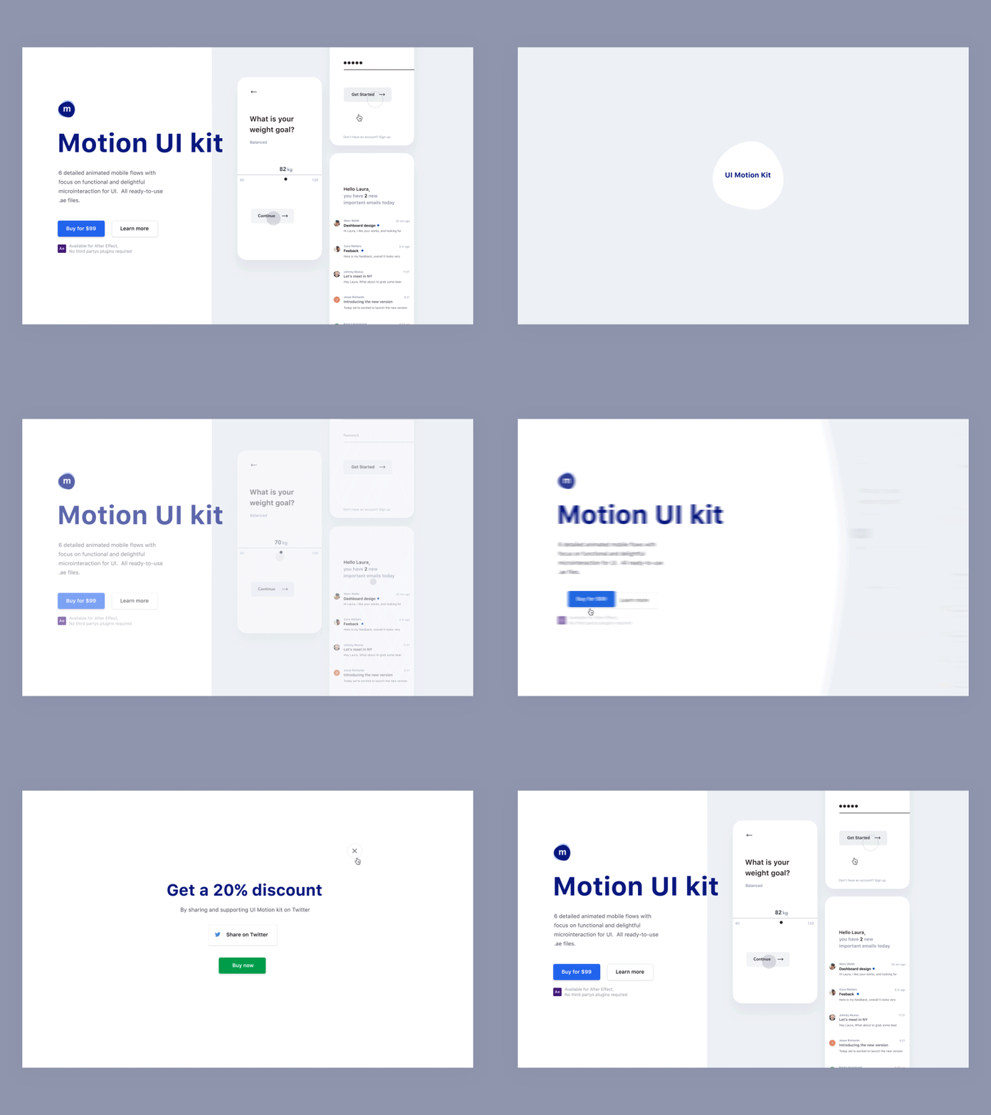
Front-end web development is all about efficiency—faster loading time and storytelling. This is because a user’s expectations have shifted as well. Now more than ever, a user demands an interactive experience when they visit any website. This is where CSS (Cascading Style Sheets) animations save the day. CSS defines how HTML elements look on a web page and helps in the creation of smoother and user-friendly animations. Read on for expert tips to level up your site:
What is the best type of animations?
Web animations can range from large video-like to simple hover states. In general, simple work best as too many complex animations tend to frustrate visitors. Subtle web interactions are more sophisticated, appealing, design enhancing, and direct the users’ attention to the significant elements on your page. Nonetheless, larger video-like animations, when used subtly for the right projects, can have a powerful impact in terms of motion graphics and an enhanced interactive experience. Some of the types of animations include:
- Feedback indicators: Hover effects, progression loads, notifications, and form validation.
- Visual storytelling elements: Typography animation, parallax scrolling, screen transitions, content fading, and walk-throughs.
- Navigation elements: Scrolling galleries and hidden navigation menus.
4 tips you can use to level up your webpage
1. Leverage hover effects and tools
Excellent webpage interaction must provide feedback to the user. CSS animations such as those on animation.css provide subtle feedback on all kinds of hover action, including button or image hover.
In general, hover actions are essential in enhancing user experience especially during navigation or offering additional information. However, these animations are not supported by mobile or touchscreen devices. But, you can find alternative techniques to display important information.
2. Adopt CSS-styled SVGs
Scalable vector graphics (SVGs) are dynamic vector elements that are usually used for logos, charts, simple diagrams, and icons. SVGs are infinitely scalable artwork-based, responsive pure and small-sized images that define shapes such as lines, circles, or rectangles. Normally, animated SVGs are produced by CSS3 (latest version of CSS).
Besides allowing you to animate and scale anything from advanced illustrations to vector icons, SVGs can be used on various navigation platforms. Generally, they inform a user that an action has been taken or demonstrate a dynamic loading image in substitute for a static image.
3. Use parallax scrolling effects
Parallax animations are excellent for visual storytelling concepts to engage users. In general, this design creates depth, adds layers and, most importantly provides a more dynamic and interactive user experience.
The goal of parallax scrolling is to provide more information, along with images or screenshots, as the user scrolls down a page. This is an excellent alternative to static sites since they offer a cohesive storyline that enhances user’s interaction with your website.
Additionally, parallax effects provide a multitude of options when it comes to integrating these kinds of animation. For instance, depending on your needs you can opt to use them as:
- Significant background elements, typography and random elements that add movement and bring the webpage to life.
- Alternatively, you can use navigation transitions to provide subtle effects that reveal new pages. Instead of the conventional static page loading, which clears the screen to reload a new page, movement on the webpage offers a smoother transition from one page to the next.
4. Incorporate interactive forms
Forms are great if you want your visitors to further engage with your brand. Generally, when visitors fill out forms on your website, you can continue to interact with them and ultimately build loyal customers.
There are a variety of ways to include forms on your website, from interactive questionnaires to natural language forms with customizable input elements.
Despite the advancements of SVG elements, HTML 5 and lightweight JavaScript, CSS animations are preferred because it doesn’t affect load time. And it’s no secret that CSS animations and transitions will always be faster than Javascript-focused effects that modify the same properties. With that said, don’t use animations just for the sake of it. Focus on including subtle properties that can improve user experience without affecting the overall performance of your site.
About the Author
Fazreen Razeek is a Dubai web design enthusiast. When he is not pursuing his passion for education technology, Fazreen writes engaging content that aims to offer advice about trending web development tools.

